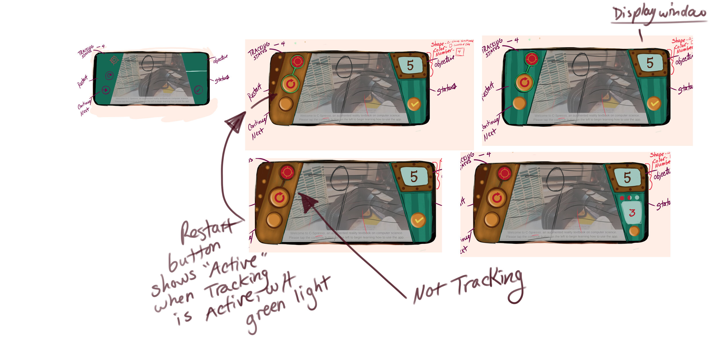
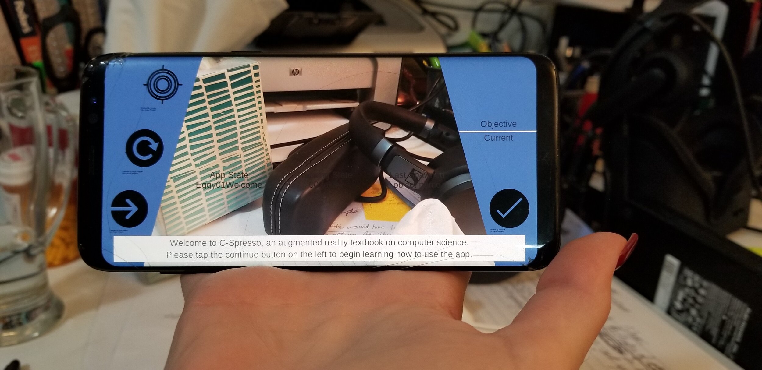
AR/VR Educational Software - Developer Blog
VR Design Doc | AR Design Doc (PDF) | Visual Development | Dev Blog | Art Book | AR App Book
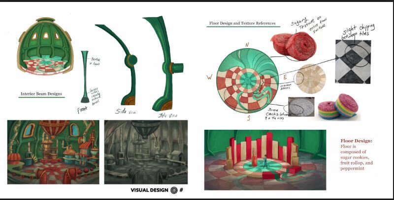
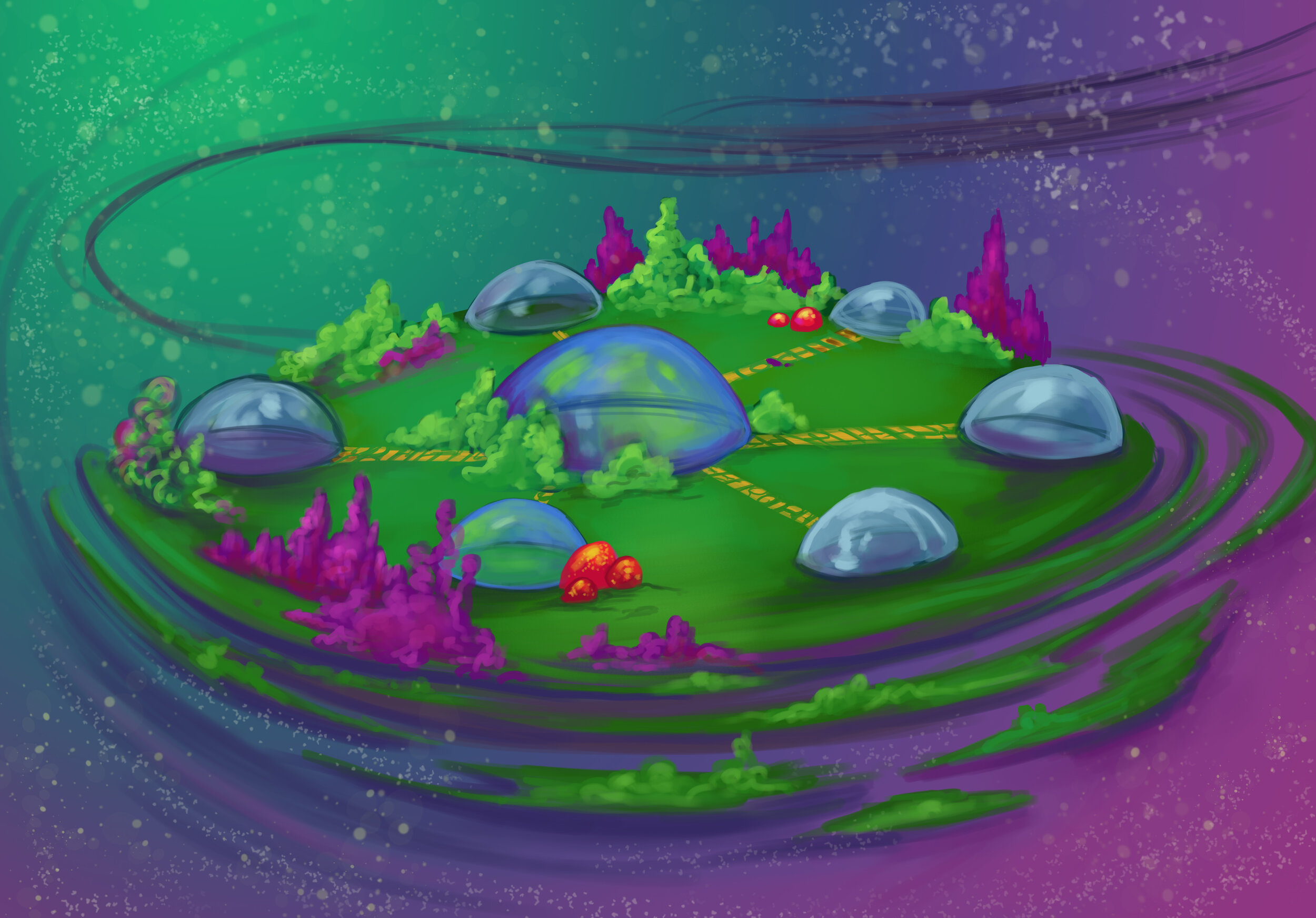
Bubble Sort Level - 10/7/19
Designing of the bubble sorts level has begun. Previous concepts of the level have been reviewed and altered to fit into the updated constraints. In order to make the experience more accessible for those who do not have an open 20 x 20 ft space or who have to stay seated, future levels will be designed so that they can be played in either circumstance (seated or free roam). For this reason, the beginning of the bubble sort level will start with a small table-top-like station where the user is trained with how to only focus on 2 objects at a time, within a longer list of objects. We have defined a learning scaffold which the game mechanics will be built upon:
Learning Scaffold (structure of the learning exp)
Must not teach more than one learning point per level-discrete learning points:
There are 2 specific points of bubble sorts
Learning point 1- you can only focus on 2 elements of a list at a time. That list is usually more than 2 elements so for younger or untrained people, it’s very easy for them to wander throughout the whole list presented to them, so just to get them to focus on 2 elements of a time is large enough to be its own learning point. When a learner is focusing on those 2 elements they have to make a decision, whether to keep them in their current order to to switch them, the lesser amount should always be on the left so you must make 1 of 2 decisions. Leave the elements as is or swap the 2 elements. Once that decision is made, the user must move their focus one element to the right, which means that the elements of focus; the previous right element becomes the left element and the unknown element to the right that was hidden is now visible.
Learning Point 2-The cycle repeats until the user is at the end of the list. Another major learning point is that when reaching the end of the list, it's important for the learner to realize that they cycle back to the beginning of the list and check 2 elements at a time, move through the list. Only when they have gone through the list and did not need to swap any 2 elements was the process of bubble sorting complete
The tutorial station determines what level of difficulty appropriate for the user. Directions will be short, maximum of 3 lines only (during prototyping stage).There is no need for a submit button because the algorithm automatically does this once user swaps objects.
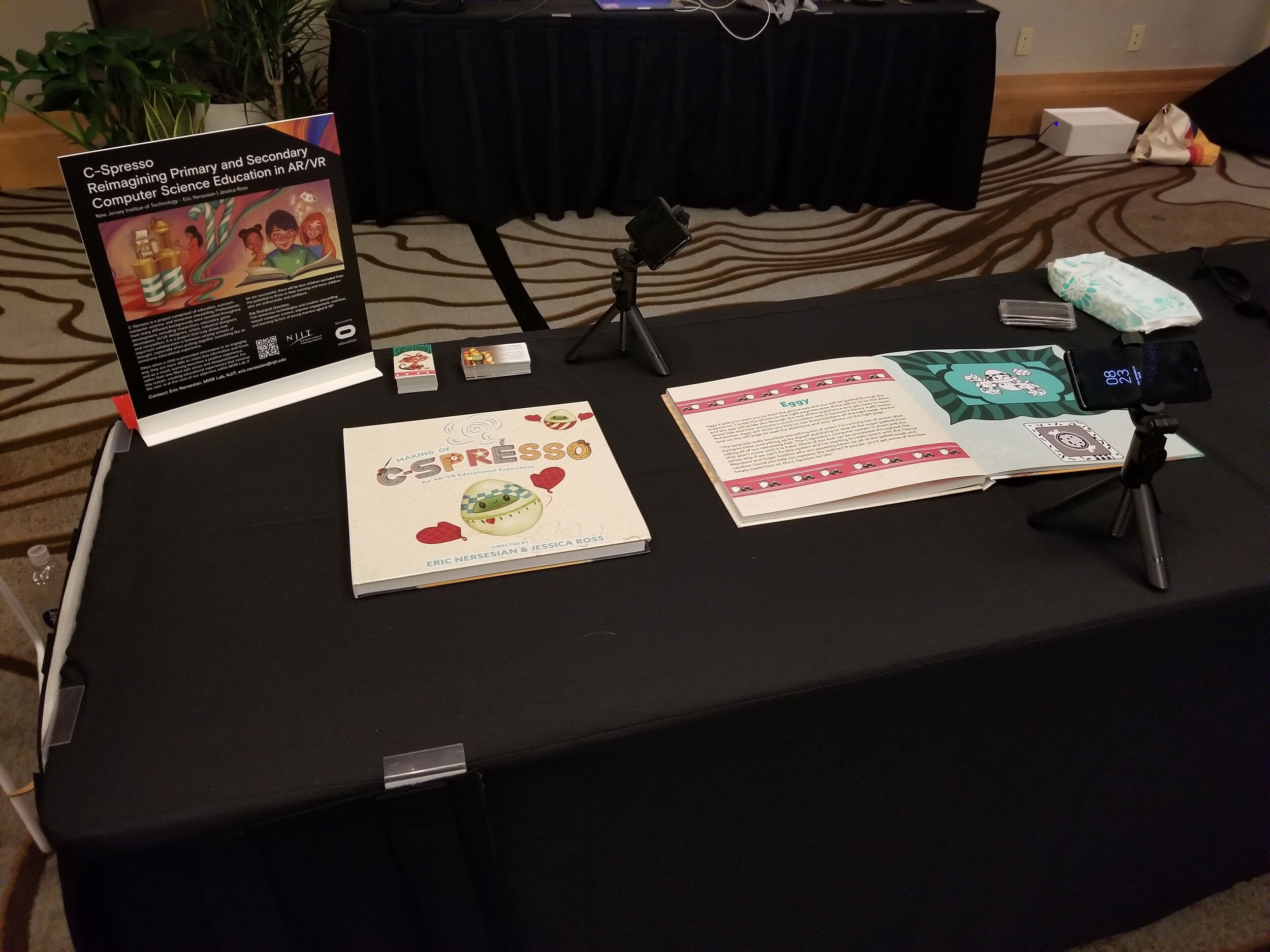
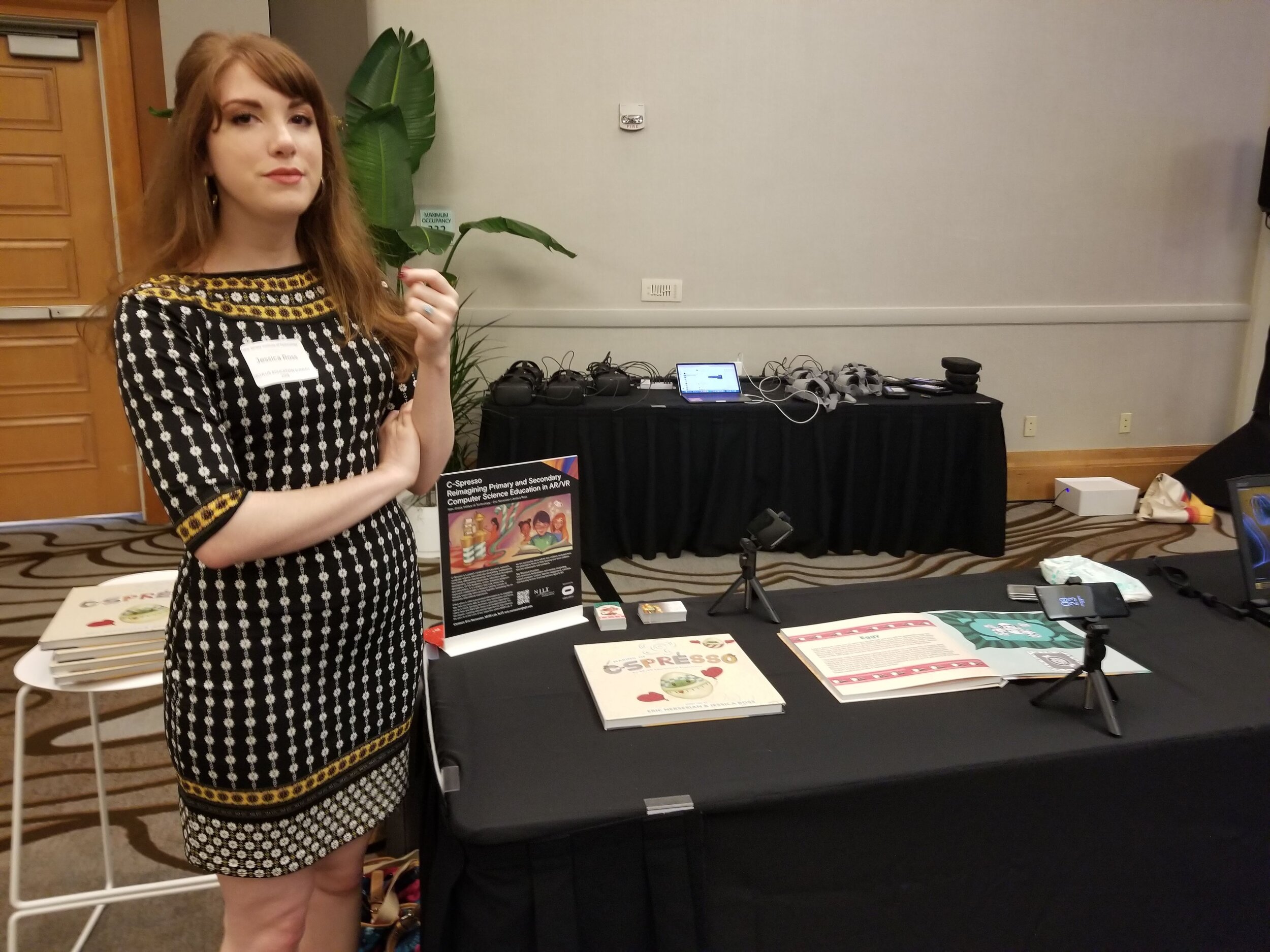
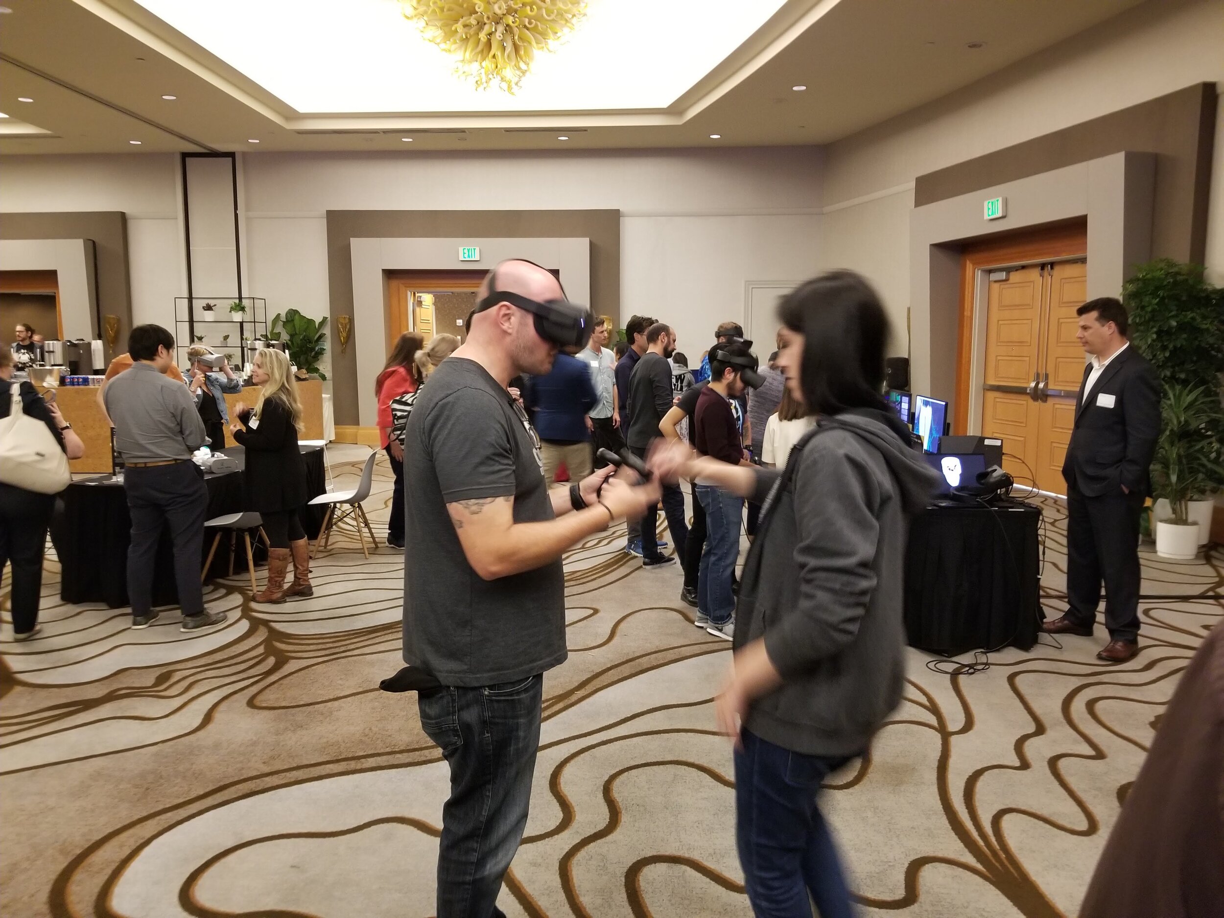
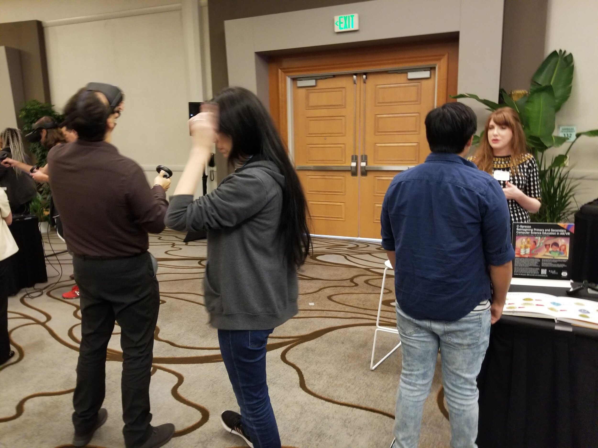
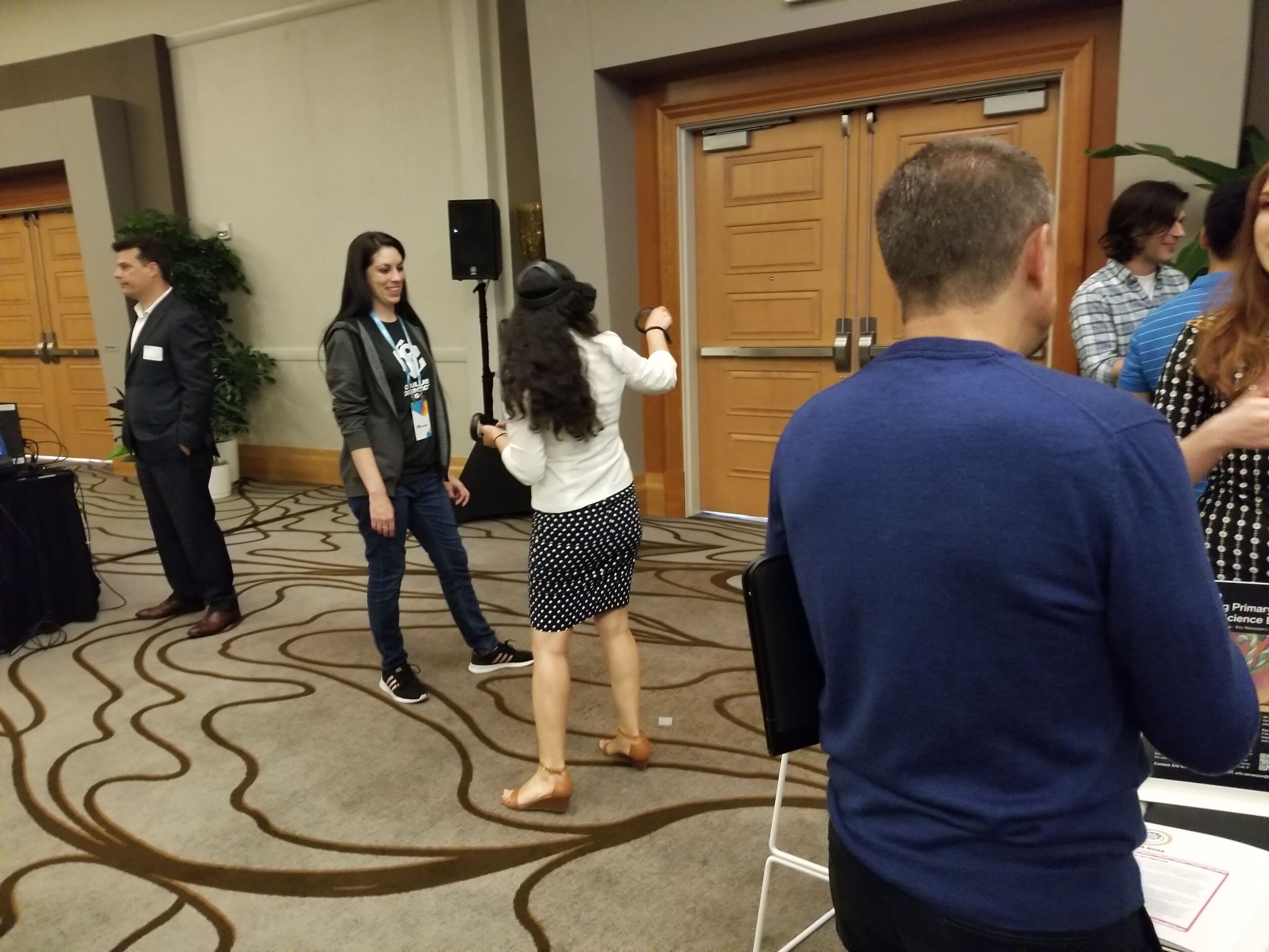
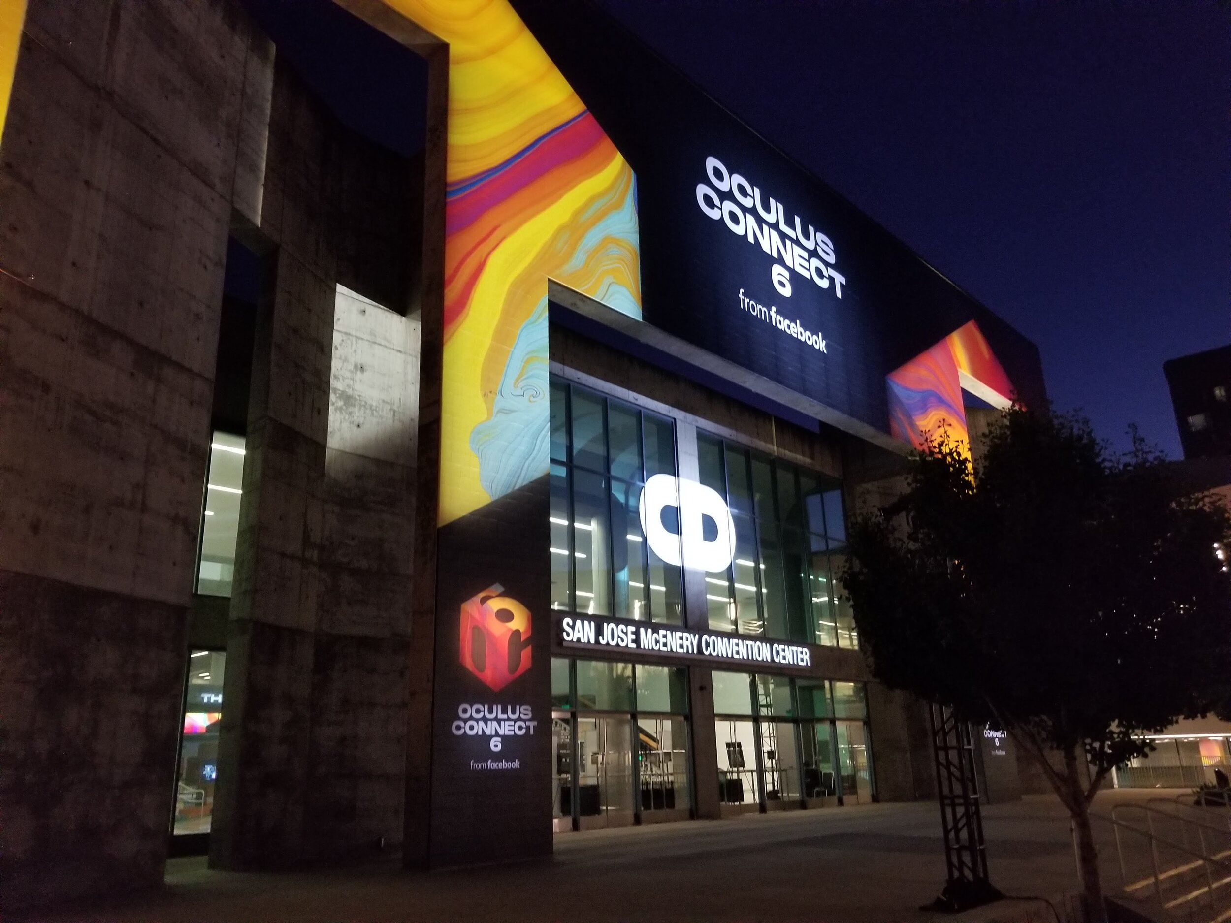
OC6 Education Summit - 9/27/19
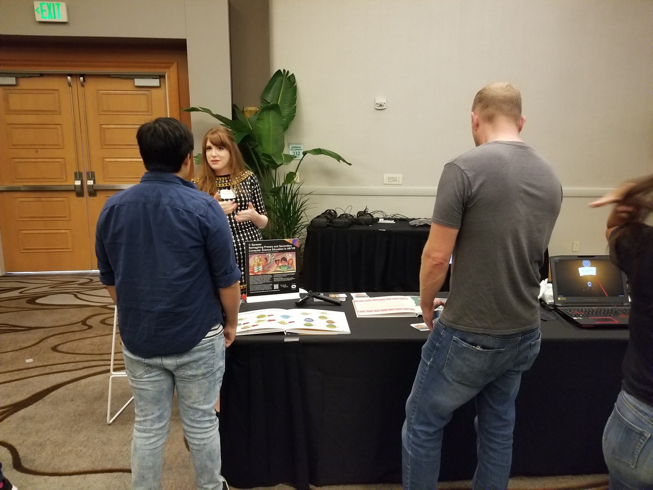
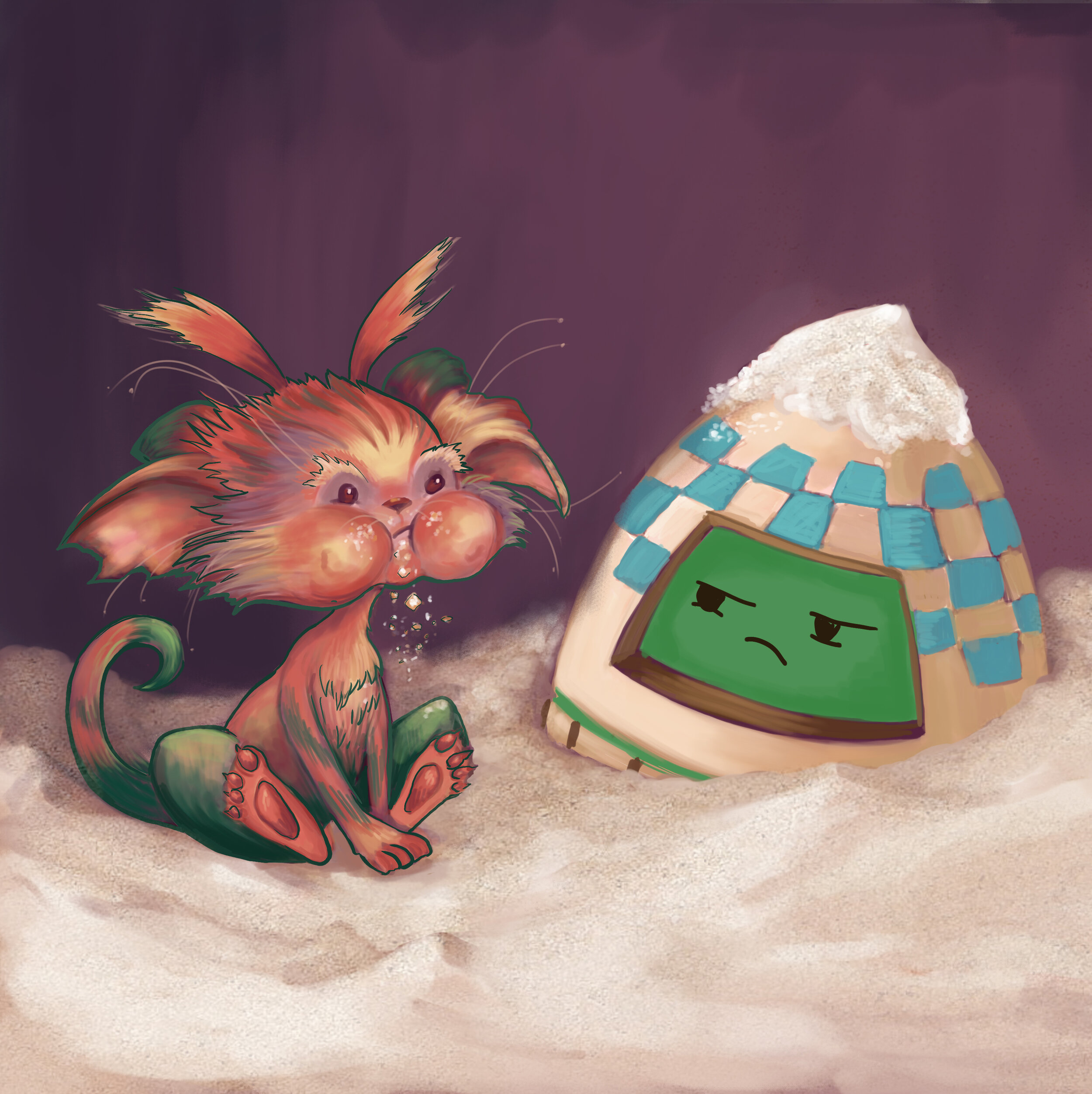
On the 24th, was the Education Summit at OC6. The team presented their AR/VR experience and had the opportunity to watch other educators, specialists, designers, and developers as they put on the Quest head set or opened up the AR text book. It was a truly rewarding experience to watch as players interacted with the world that this team had spent the last 8 months designing and developing. Eggy was a hit and everyone was interested in seeing more of him and the Sugar Goblins. Several educators expressed interest in using the application in their own classrooms where they teach CS and many others were asking about the next few level designs.
Many attendees were interested in purchasing both the process book and AR textbooks.
Eric Nersesian, was invited onto a panel discussion about educational VR and to present the project in an individual presentation. The presentations and panel discussions raised a lot of interest into what the team at MIXR lab was doing and what the future plans are for C-Spresso.
First image: Poster Design by Monica Gouveia-Cabral
Second Image: Poster Design by Jessica Ross-Nersesian
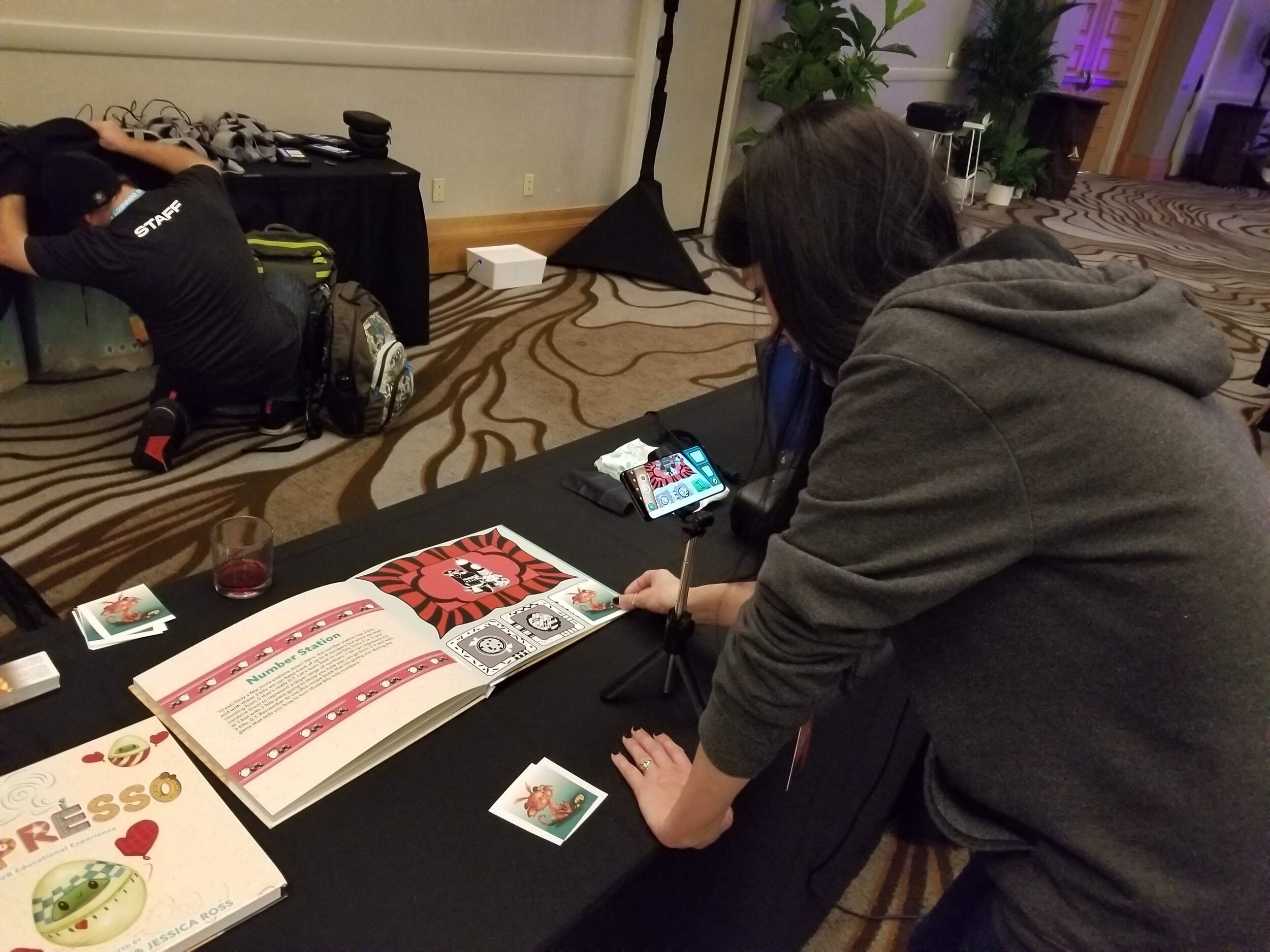
Nearing Completion of both AR and VR Apps - 9/9/19
AR enhanced textbook app and standalone VR app are both near completion for OC6. Most 3D models and UX flows have been updated in both AR and VR apps. Both apps along with a process book will be demoed at the Education Summit, which will be on registration day, 9/24, of OC6. The design team has been working with developers and UX designers to gather all archived research, visual development, 3D models, and UX which will be included in the process books. The purpose of these books is to provide an inside look of what went into building both the AR and VR experiences. Collaboration between many different minds and skill sets was essential in creating a mixed reality, educational experience. This is what both process books should demonstrate.
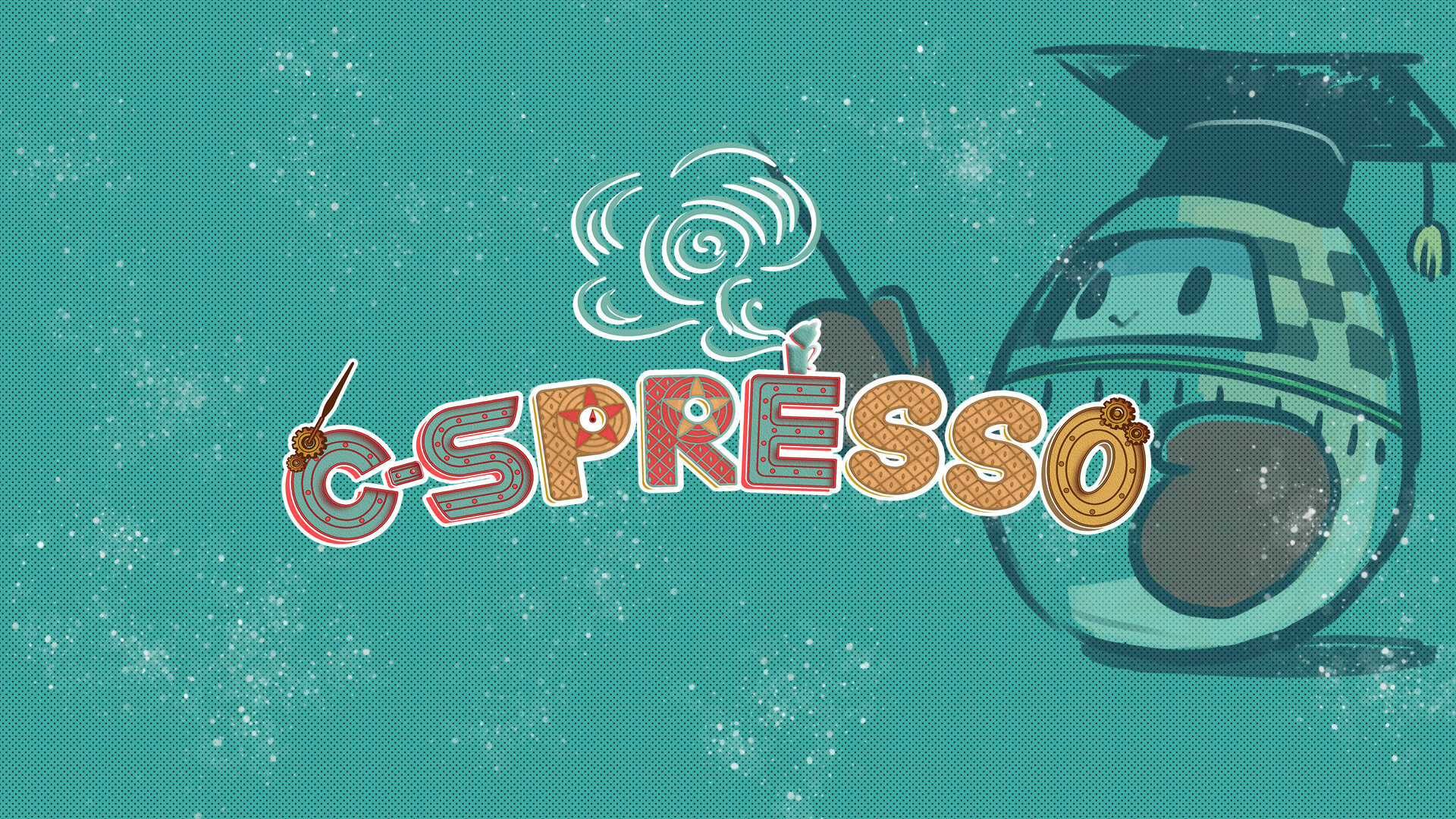
Look and Feel of C-Spresso - 7/25/19
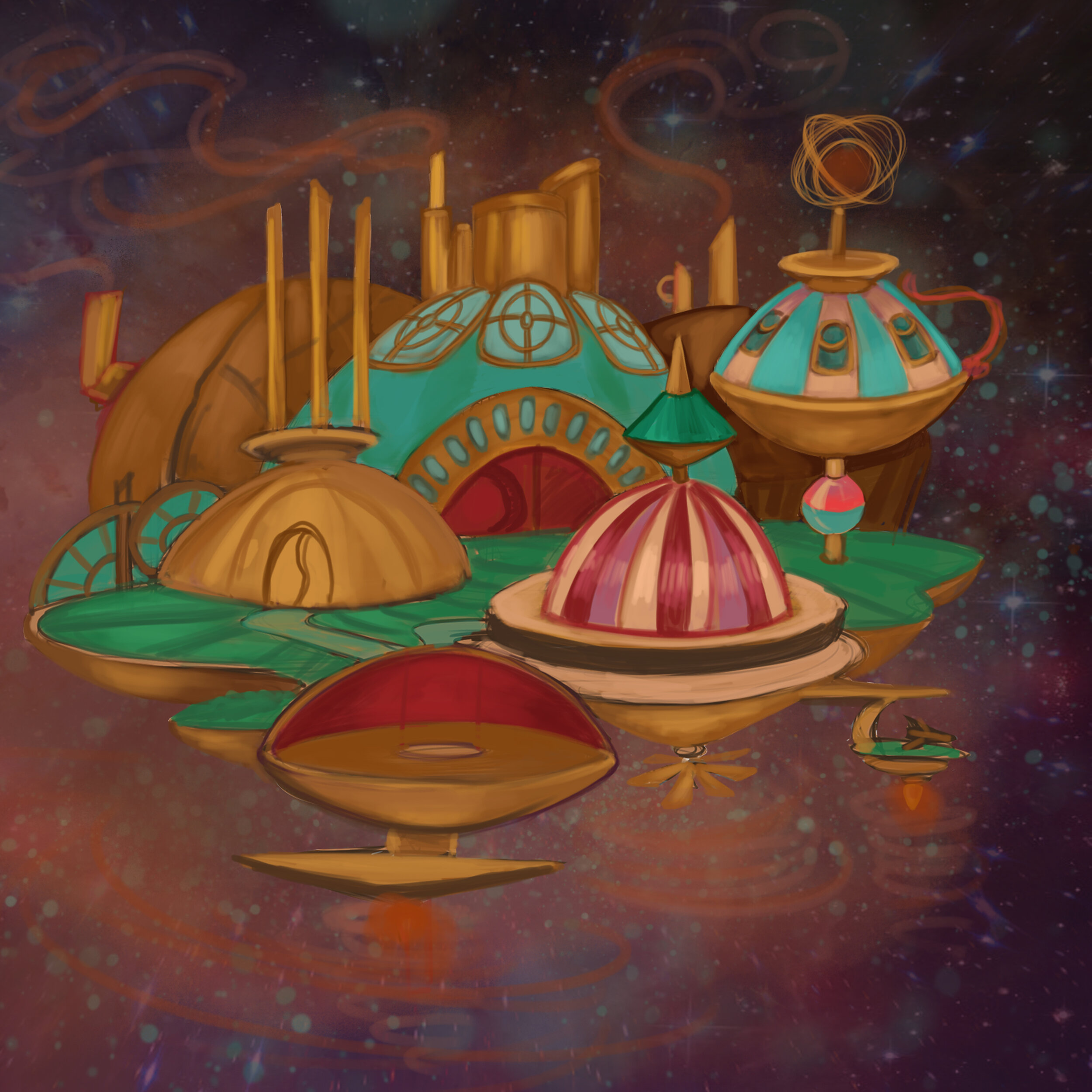
Refinement on the C-Spresso ship was the goal of the design team. After reviewing previous concept sketches and rough 3D concepts, alterations were made and the identity of the ship and the world it inhabited began taking form. The team had made a decision early in pre-development discussions, that this CS educational app for the Oculus Quest, must be engaging to both boys and girls, of varying demographics and levels of CS knowledge. This application is meant to be inclusive, inviting, and an encouraging space for students to learn CS. The design of this world and everything in it, must fit this original objective and it is this reason why the theme, color palette, shape scheme, and personality had to be something that could be perceived as neither masculine nor feminine. To do this, the designers spent a great deal of time researching what genres have a wide demographic which does not exclude any gender.
The team decided on a world which is based off of a sci-fi/space travel story, but with a whimsical, wonky, atmosphere devoid of laser beams, weaponry, or muted color palettes. The world of C-Spresso is made up of sugar, candy, tea cups, coffee beans, and space travel. This blend of themes is one that the design team believes is best suited for the project’s original objective.
The Ship - 7/24/19

Although the theme and even the world had been developed, much of the pre-production work had not yet taken form. This was crucial for the rest of the team to justify design decisions made during this month long period and to give the whole team direction in what to design and how to design it. A period of design research was needed to complete the pre-visualizations of the world, immersion, and stations. Artists reviewed previous references, design notes, and inspiration sources and from here, were able to solidify a more clear vision of the production. This information was then acquired to tackle to ambiguity of the ship and station design.
Visual development artists began by sketching out the world where this ship may exist and how the ship looks in that world. Different designs were experimented with, ranging from sci-fi, fantasy, candy, steampunk, and various children’s game titles.
Back on the Project - 7/23/19
Work on the Quest project has started again after about one month. During the past month, designers were occupied with another deadline which needed a majority of attention from much of the team. During this period, the modeling team was given directions and sketches of a few of the stations to model. Art direction and design was to reorient the team members (including designers, researchers, and programmers), with the overall look and feel of the experience and learning objectives. Due to the fact that in VR, everything will be to scale of the user, the design team needed to collaborate with an industrial design expert, to ensure that the end product would be an ergonomically sound, interactive environment. The industrial design expert worked with 3D modelers and visual development artists to add ergonomic alterations to the original designs. Considerations to the designs of the stations such as height, size of levers vs size of the user’s VR hands, and functionality were the focus of updating the designs.
Physical Prototyping of Bubble Sort Activity - 6/23/2019
During today’s meeting, team members discussed upcoming deadlines, goals, and how to continue designing the experience. All team members agreed that another activity would have to be brought into the gameplay to break up the stations activity. One way to do this is to introduce Bubble Sorting, which is a CS term referring to a sorting algorithm that works by swapping adjacent elements if they are not in the correct order. This process is repeated through a list of different values until the entire list is sorted.
First, the team set up a paper prototype of how a Bubble Sort activity would work. This was simply done by writing 7 different numbers, each on its own post-it. Team members who were not already familiar with this concept, practiced swapping the adjacent post-its down the list, keeping the larger number always to the right of the lower number.
This process was then followed by taking physical objects and sorting those within the space that users would be playing in, during this activity. Boxes with different numbered post-its were placed in a half circle arrangement and team members collaborated on different fun ways to incorporate this concept into the gameplay of the current prototype.

Initial physical walkthrough of a bubble sort activity

Revised physical walkthrough of a bubble sort activity
After these physical prototype exercises, the designer collected all necessary information on what was observed during the prototyping and began to draft concept sketches of how this Bubble Sorting activity could integrate into the game.
One team member wanted the user to sort containers of objects, created during the stations portion of the game and another team member preferred that the user sorted pegs with different number or size values assigned to each one.
Bubble Sort Gameplay Concepts - 6/22/2019
Regardless of what was going to be sorted, it was understood that a reward at the end of the activity was crucial, to give the user a sense of validation after successfully completing the exercise. This is how the assembly portion of the experience was formed. Once the user completed the bubble sorting activity, he/she will be able to assemble something from the objects created in the stations area. More thought is being given to how to bridge these concepts together, but currently the team has the following ideas to start with:

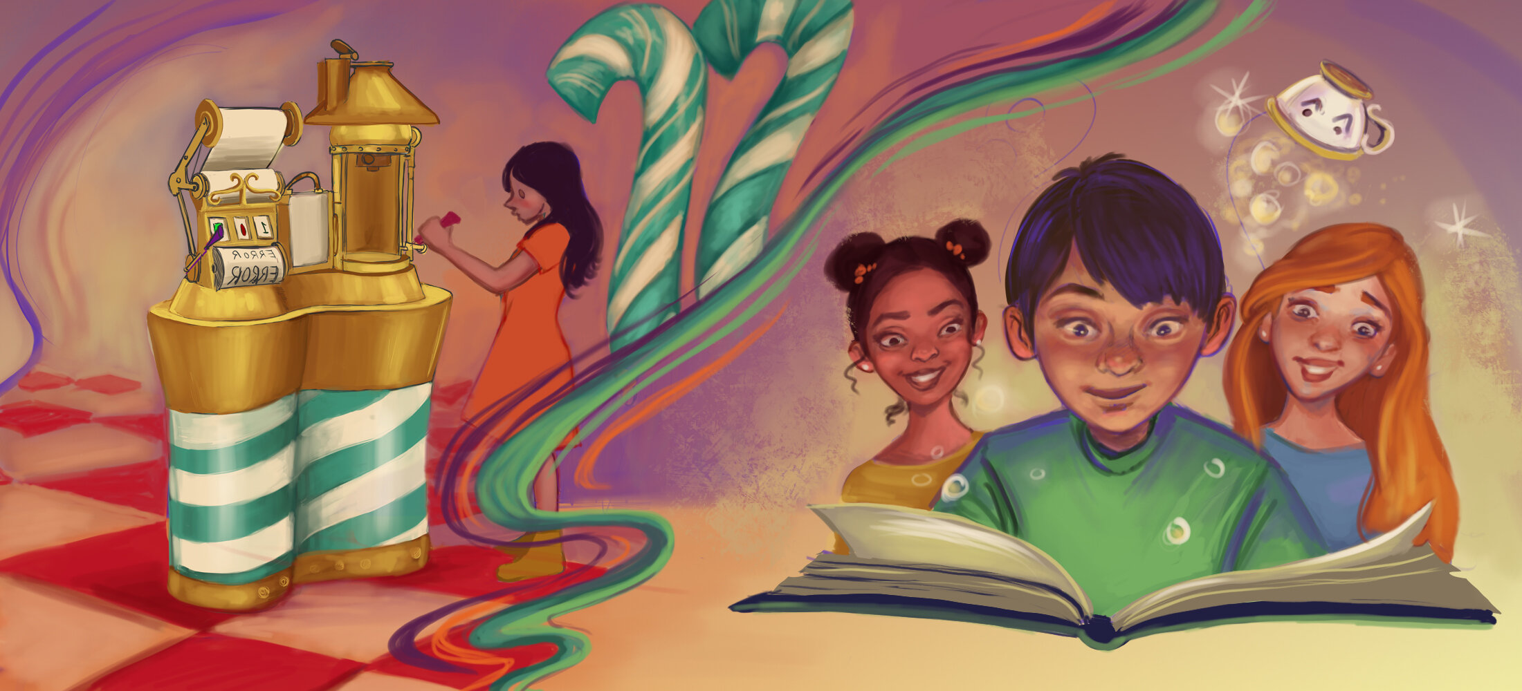
All the design results for our brainstorming session on prototyping bubble sort activities with all possible sorting activities and gameplay elements: containers, shuffle tea cups, lanterns, candy canes, pegs.

Concept design 1: Containers with multiple objects
Assembly activity concept 1: Numbers = Size. Once user has completed the bubble sort activity, he/she gets to assemble something out of their shapes. The number of shapes collected equal the size of the shape. Example can be seen in top right of this illustration. User gets to choose if he/she would like to make more shapes to assemble something greater or just use shapes that he/she already has.
Binary math area is connected to the bubble sorting area by a long pipe, which all created objects flow through and end up in the bubble sorting dome. The user gets to ring the bell once he/she has completed the activity.
User sorts the containers of objects that are hanging on candy canes. Number values are determined by counting the number of stripes on each candy cane. Alternative version of this sorting activity is that user sorts lanterns with the shapes previously created inside. Number value is determined by how many of each shape is in each lantern. User has to hang the lanterns in the proper order on the candy cane hooks, which stay in place. Once activity is successfully completed, all lanterns light up.
The last concept we generated for bubble sorting is to let users sort the objects according to size, instead of numbers and put together a train track if exercise is done correctly. Shapes created earlier in the game can be put together to make part of a train and its tracks.
User Study Learning Data Analysis - 6/22/19
Below is Dr Lee’s analysis of the learning assessments indicating the users in VR learned binary math just as well as the group who Dr. Lee taught using CS Unplugged.org methods. The classroom exercise consisted of cards with different binary numbers on the front and back, which the users had to flip up or down, to represent the desired number in binary.
This finding proves no statistical difference between our control and experiment groups, meaning that the VR experience is just as educational as an instructor-led lecture without the variability of instructor quality and restrictions on instructor availability and locality. These results revealed that the Quest experience is in fact, educational, and suggests that it may have some benefits over traditional teaching methods. Due to these findings, the team will be developing the experience further:
Preliminary Results
A. Differences between Pre and Post tests within each condition*
First, we see if there was a difference within each condition (e.g., control pretest vs. control post-test), to see if there was any affect by the interventions. The first intervention, in the control group, was a professor teaching a class of middle school students (n=15) how to count in binary up to 3 digits. The second intervention, in the experimental group, was a VR activity teaching middle school students (n=19) how to count in binary up to 3 digits. Students were given a pretest and post-test with 12 questions each. Here, “Total Q” (in Figures 1-4) all refer to the total number of questions a student got correct on either the pretest of post-test. The minimum score is 0; the maximum score is 12).

Figure 1. Differences between Control and VR groups’ Pretest Scores (none)

Figure 2. Differences between Control and VR groups’ Pre-test Scores (none)
As seen in Figure 1, the control group participants did not do very well in the pretest, but showed a statistically significant increase in their post-test scores, suggesting that the lecture helped them understand how to count in binary (up to 5 digits).
As seen in Figure 2, the experimental (VR) group participants also did not do very well in the pre-test, but showed a statistically significant increase in their post-test scores, suggesting that the VR activity helped them understand how to count in binary (up to 5 digits).
B. Differences between Pre and Post tests between conditions*
We also want to see if there was a difference between condition (e.g., control pre-test vs experimental pre-test), to see if there were any differences between the classrooms.

Figure 3. Differences between Control and VR groups’ Pretest Scores (none)

Figure 4. Differences between Control and VR groups’ Posttest Scores (none)
Figure 3 shows that the control condition and experimental condition participants both started off the same, without any statistically significant difference in their pretest scores. This means that statistically, these students all started off the same (i.e., they did not know how to count in binary).
Next, Figure 4 shows that after the treatment (either a lecture or VR), there were no statistically significant difference in their post-test scores. This means that both the lecture and the VR activity were statistically equivalent in their effectiveness teaching the students how to count in binary. (Looking at the box-plot, it does look like the control condition students did a little bit better overall in the post-test compared to the experimental condition, but not enough to make a statistically significant difference).
* For these calculations (all using Wilcoxon Rank Sums), some students’ pre-tests or post-test were missing. We know we had 15 control group participants and 19 experimental condition participants, but we are missing some of their sheets, so there are some missing rows in our calculations, which may ultimately change our results as our sample size is relatively small.
User Personas - 6/21/19
Before moving forward with the visual design, story line, and theme of the experience, the team will be evaluating who the target audience is and how to collect information on what they are drawn to, visually. The users previously tested, were ages 11-14 and were varied in gender and ethnicity. We focused on this age group, which is also the age when most students will typically be introduced to computer science. Moving forward with future testing and for the continuation of development, the team will be focusing on middle to high school students, making the ages 13-16 (7th to 10th grade).
This is not to say that designing and testing other VR experiences will be exclusively on these age groups, as the team believes it will be highly beneficial for younger students (ages 11-14), to be exposed to VR and have a helpful outlet to learn computer science.
Another key focus for the users in which the team is designing for is underrepresented minorities in STEM, such as females, handicap, and ethnic students. These groups of children are in need of better access to education within the STEM field and so this is the core intent at the heart of developing this experience.
Informal Findings of User Study Data - 6/20/19
The team spent time analyzing data from the June 8th study that took place at Science Park High School. Researchers, educators and designers sat and decompressed what was observed and collected from the post and pre tests, as well as the ethnographic observations. Both researchers found that the students did just as well on their binary math tests after a class with a certified instructor as the other students who received their lesson in the Quest application.
Other key findings included the following:
Request for more content
Request for more rewards after successfully completing tasks (as of now there is no reward system in place)
More “small wins” instead of 1 big win at the end of one interaction loop (this feedback primarily comes from female users)
More interactives and play between the binary math exercises
Gender specific feedback- Requests for fighting abilities from the males while the females were happy in the ability to take their time and solve puzzles, rather than fast paced, fighting gameplay.
A guide or some sort of helper during experience
All of this feedback and observation will continue to be analyzed and referenced for future design and development decisions.
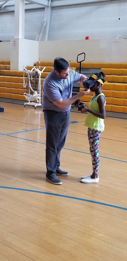
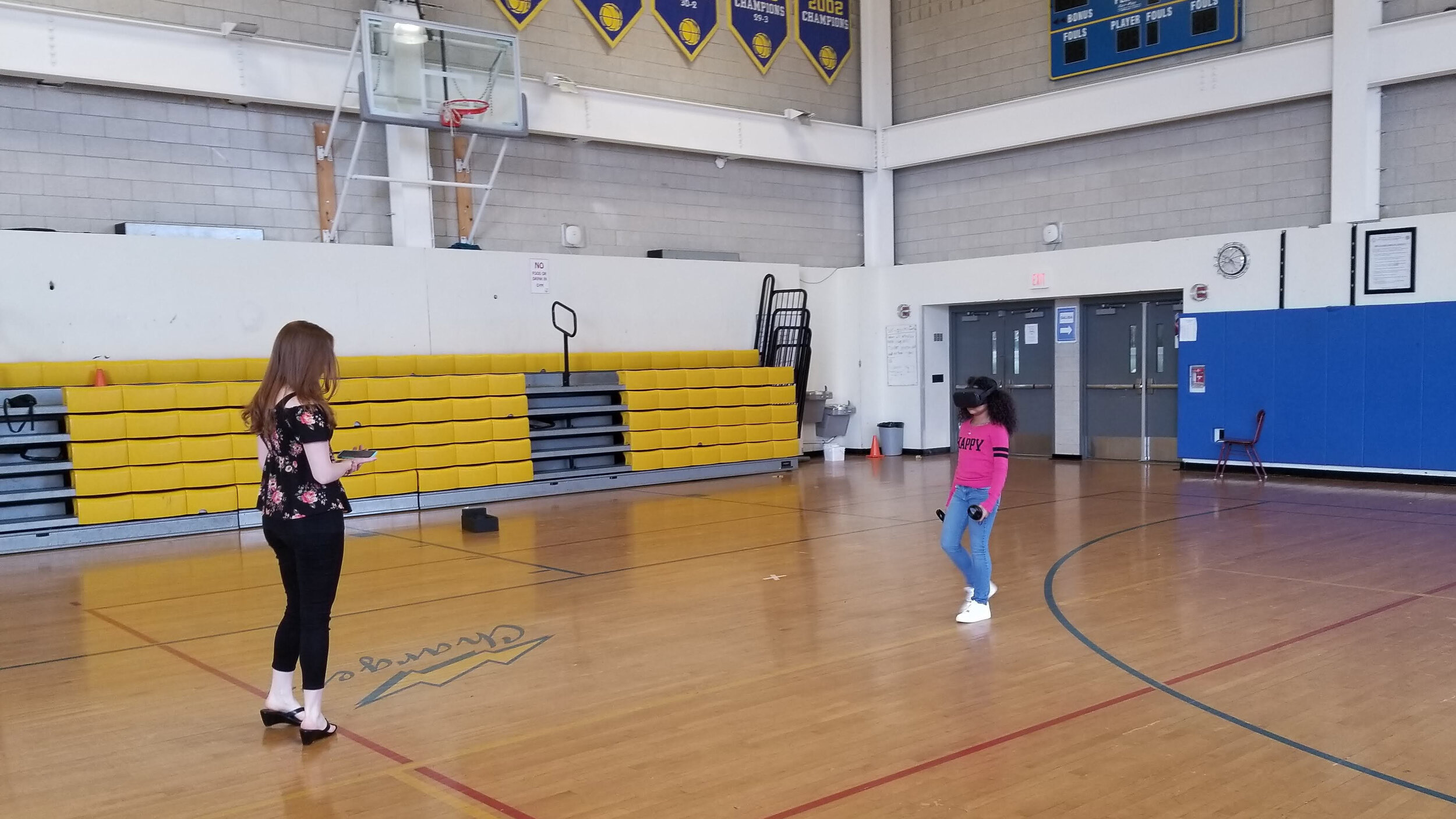
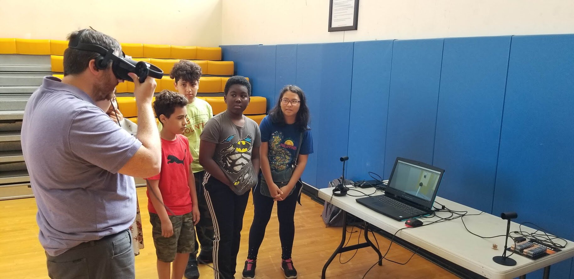
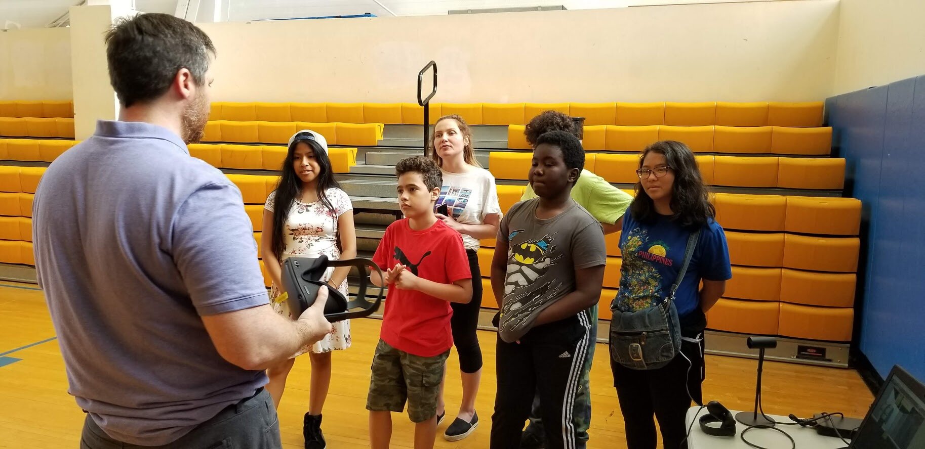
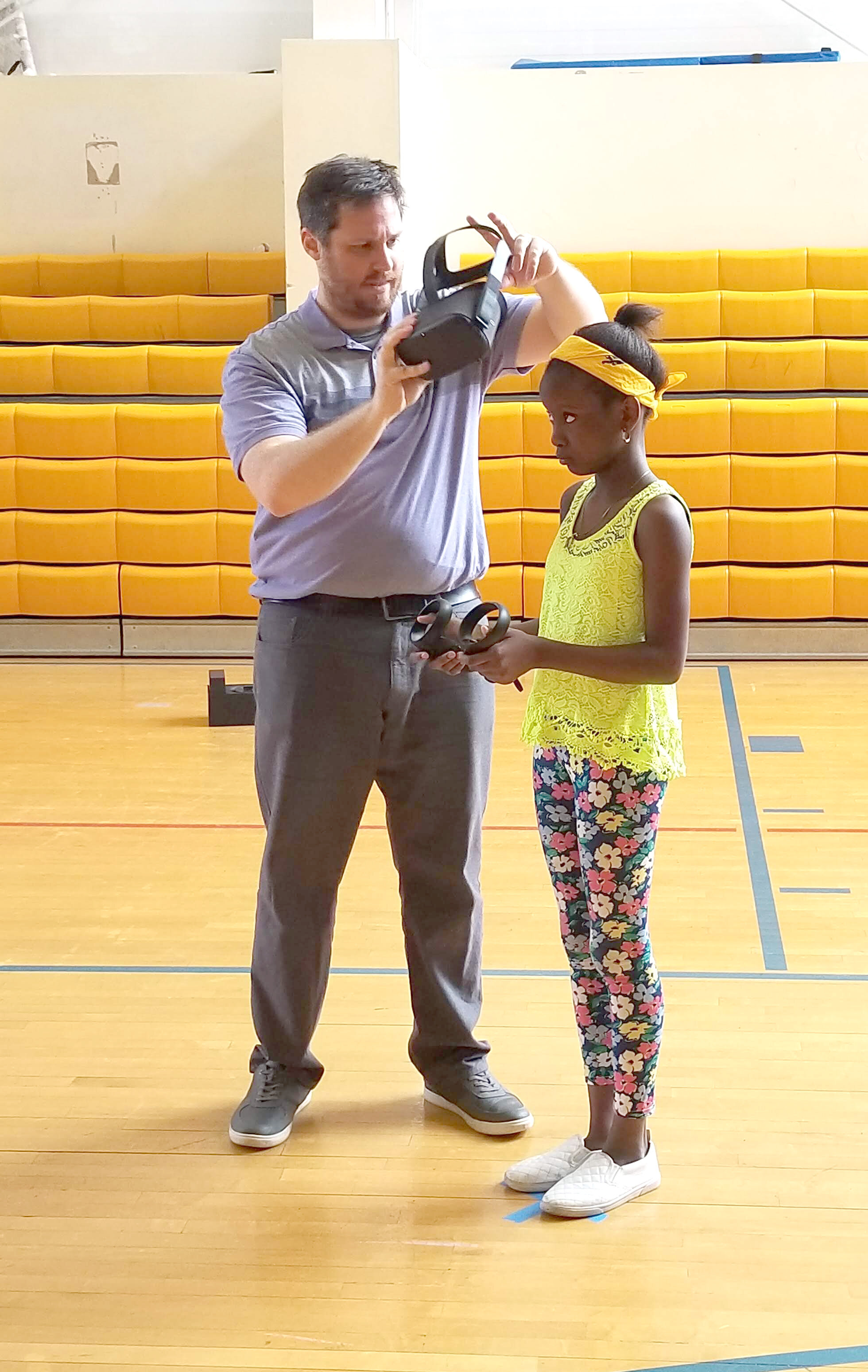
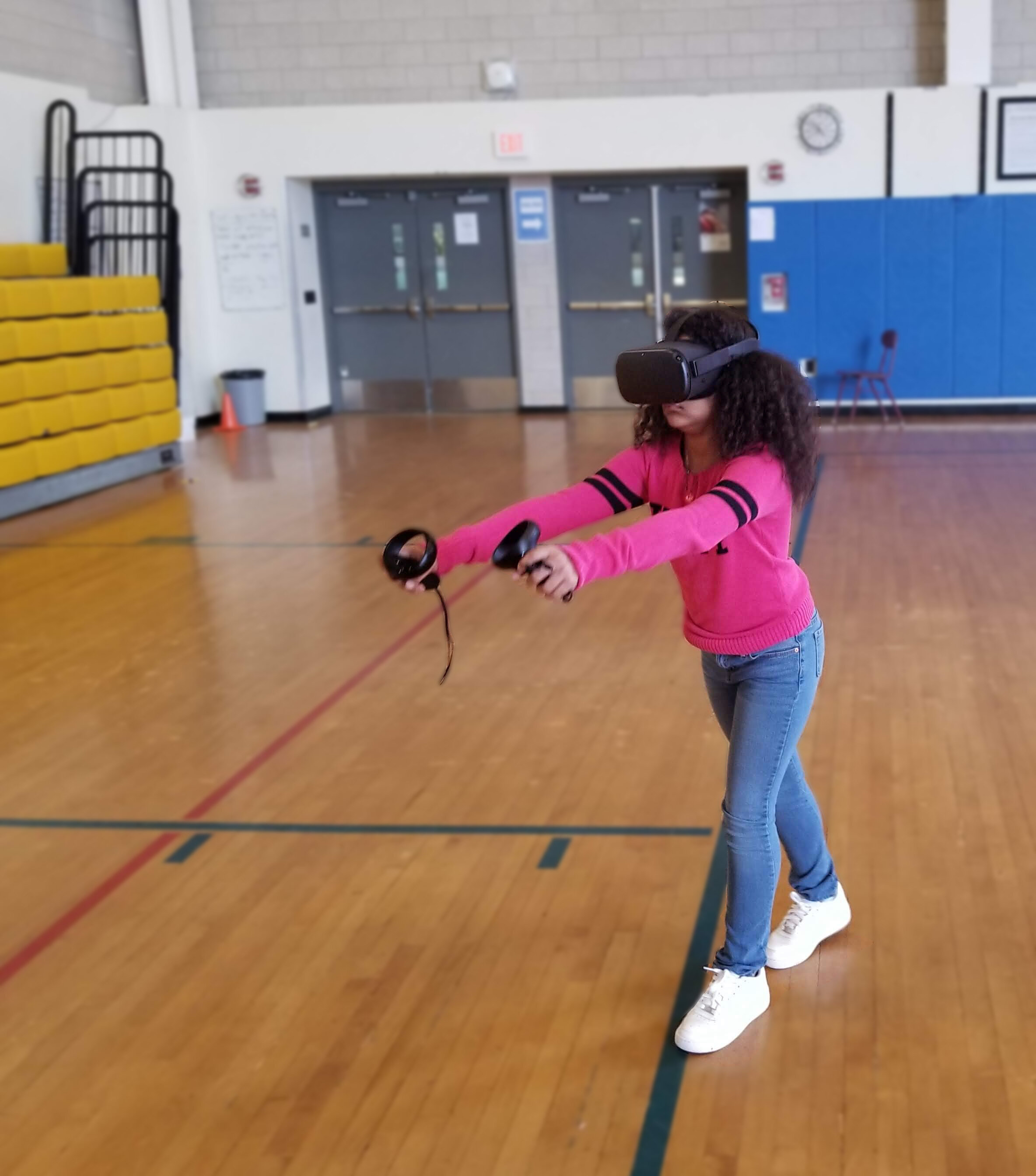
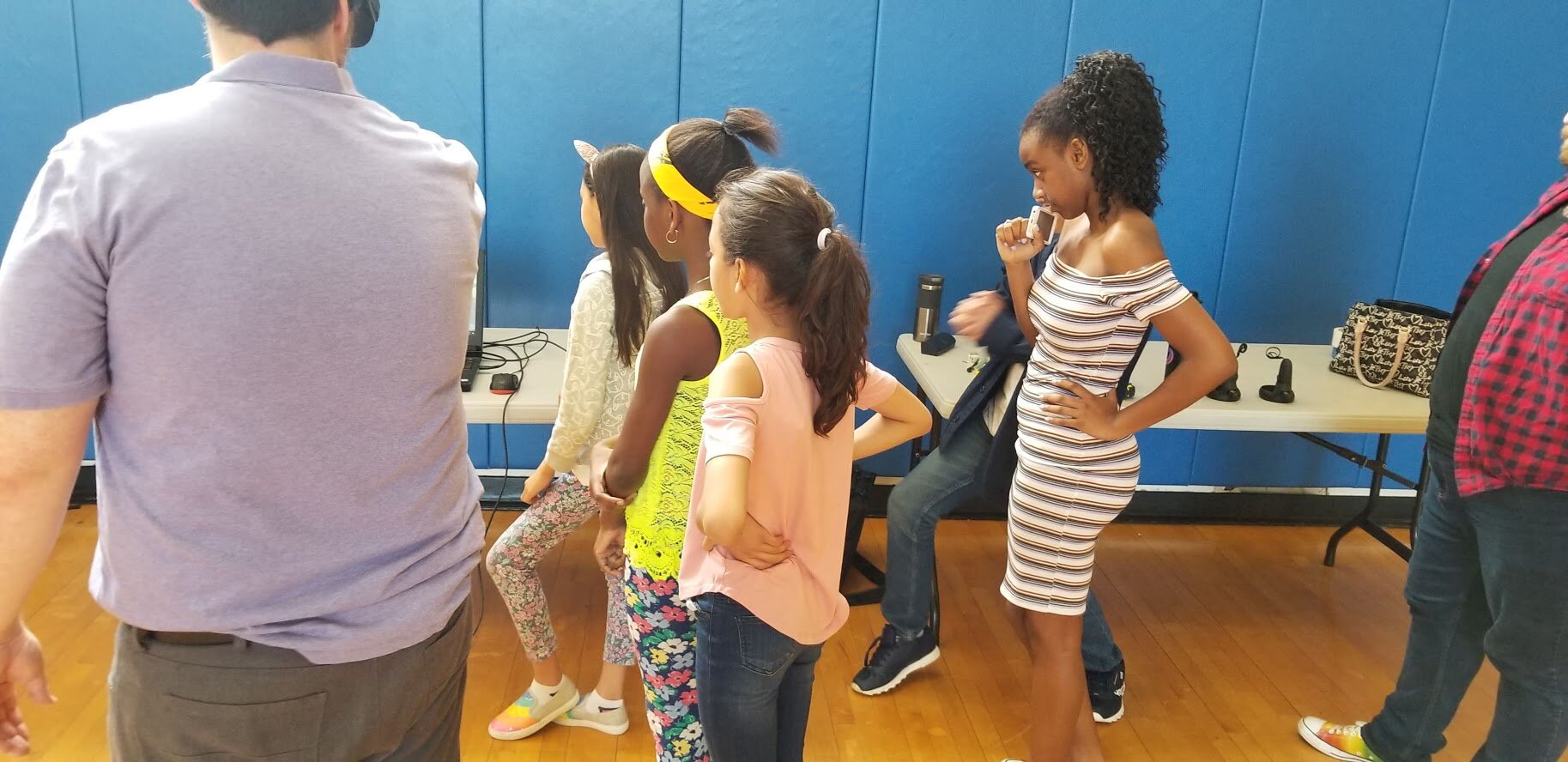
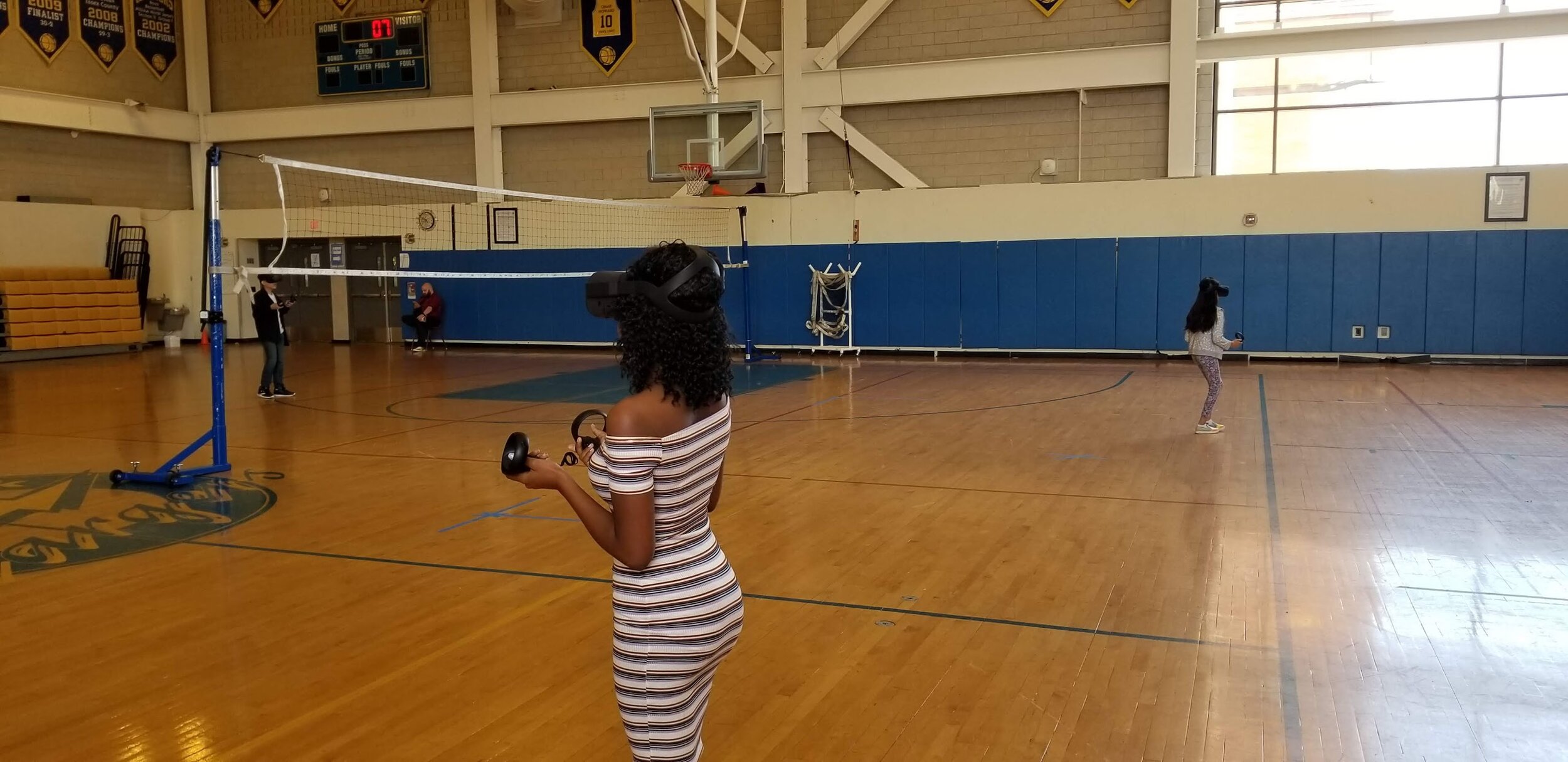
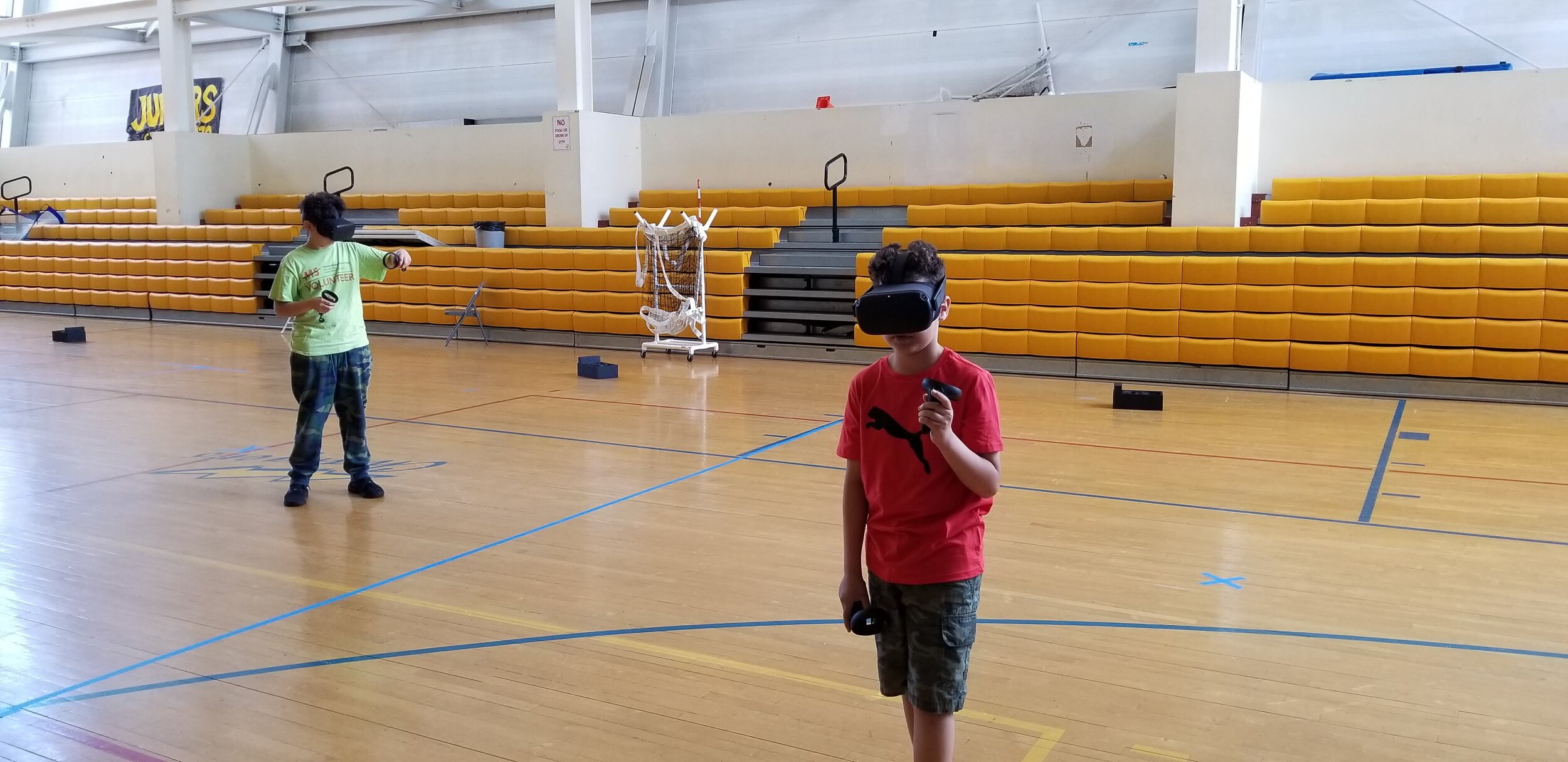
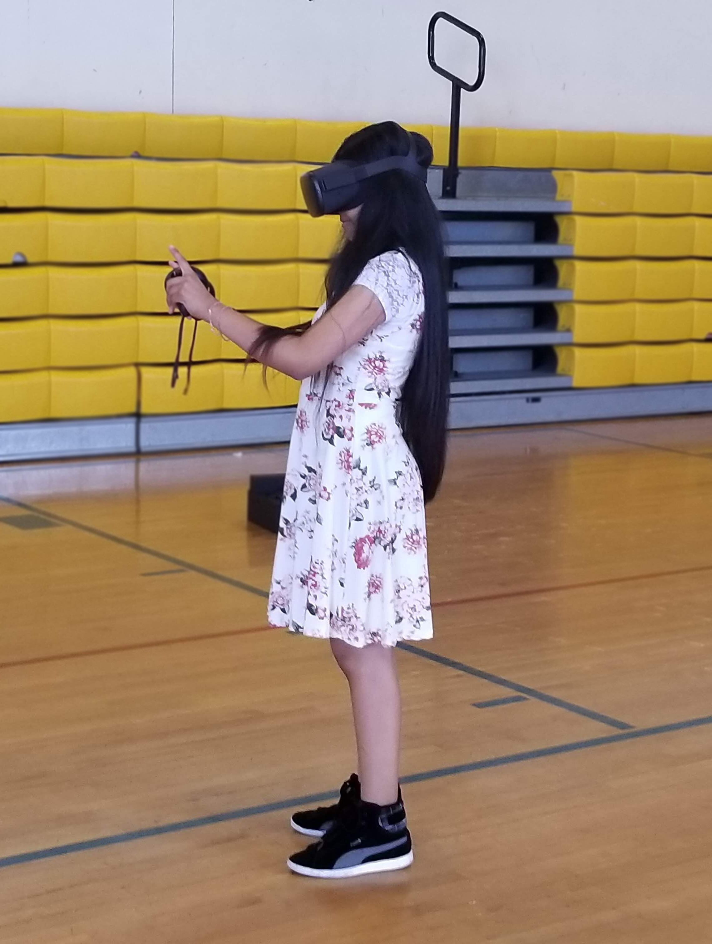
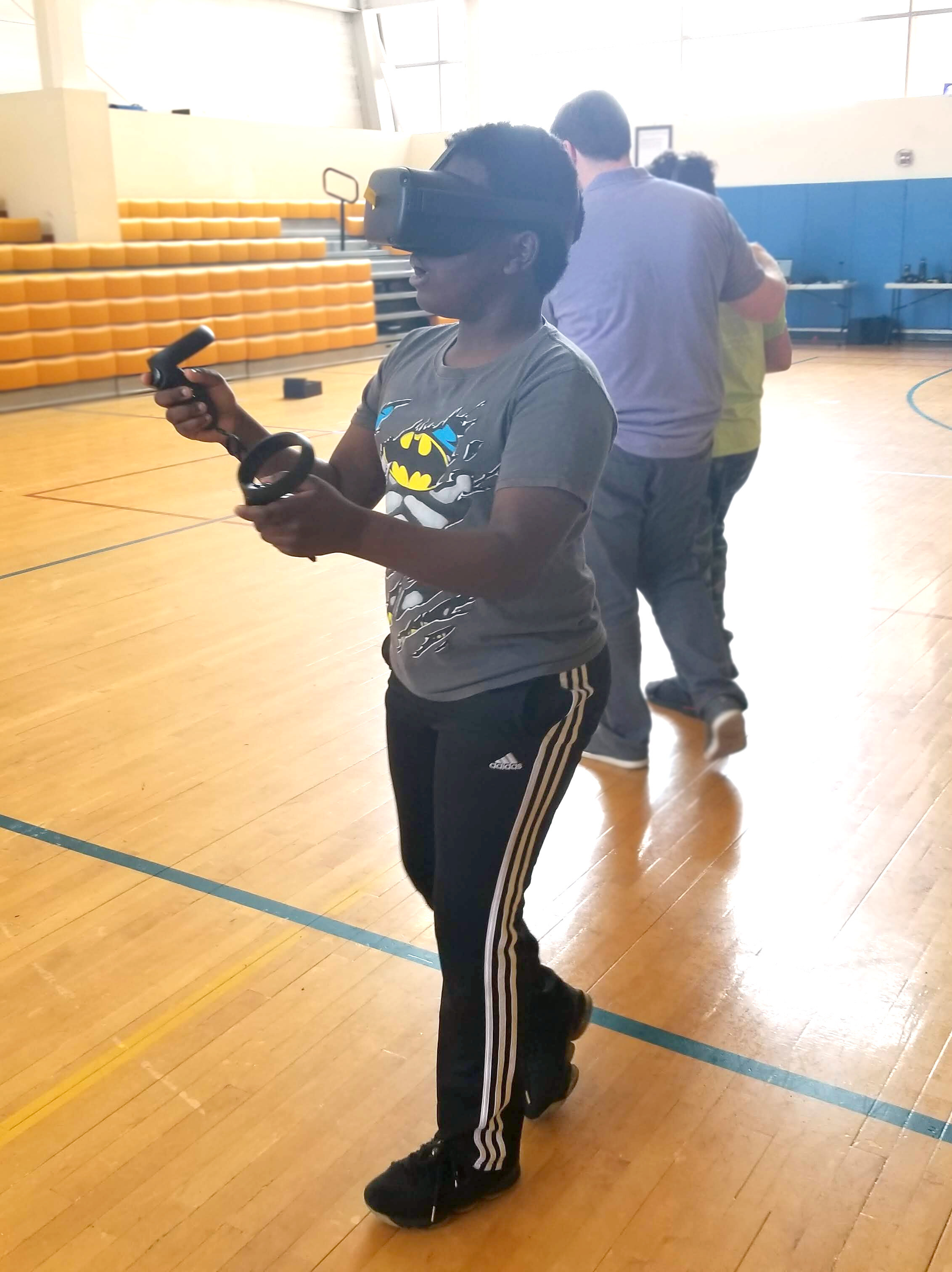
First User Testing of Prototype - 6/8/19
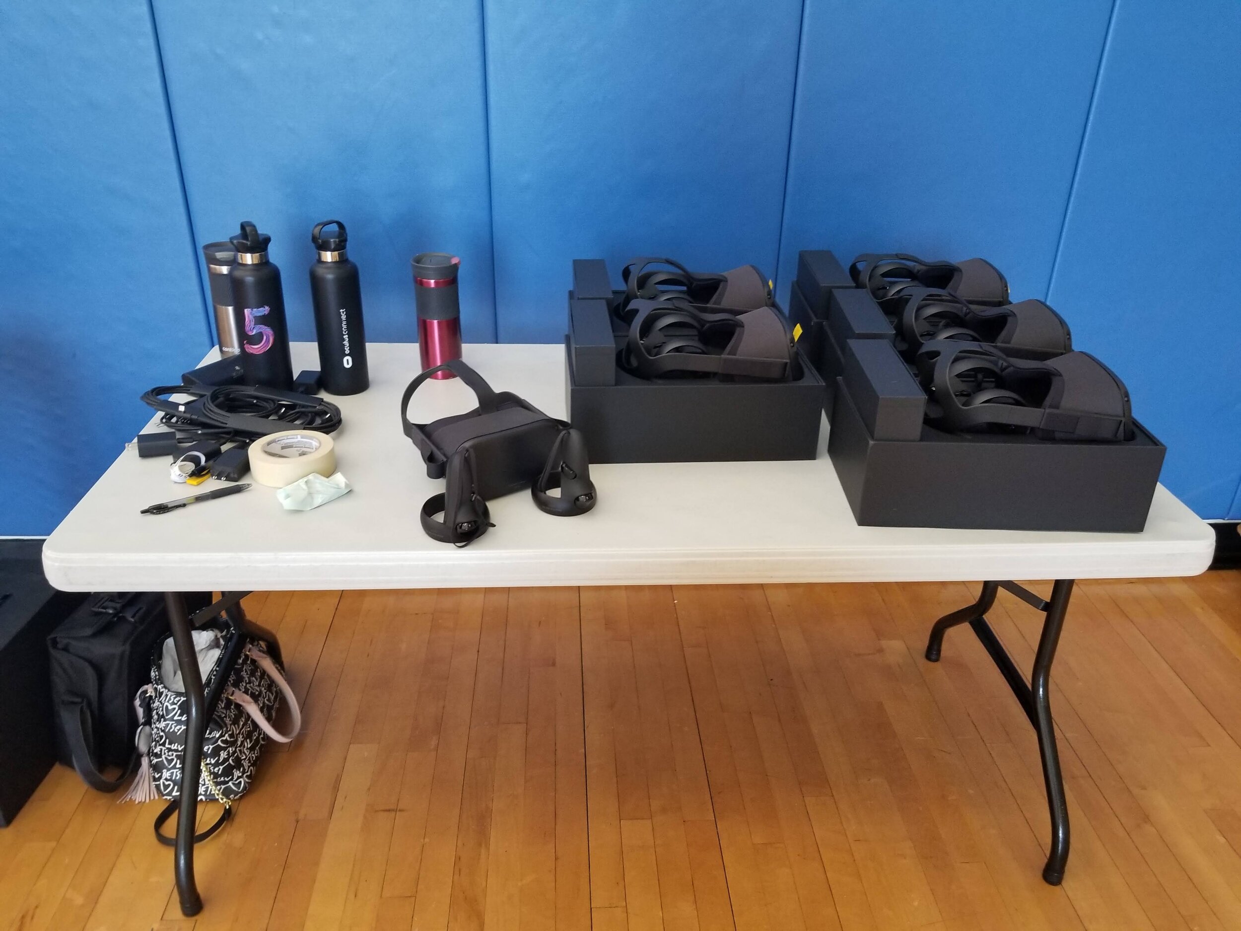
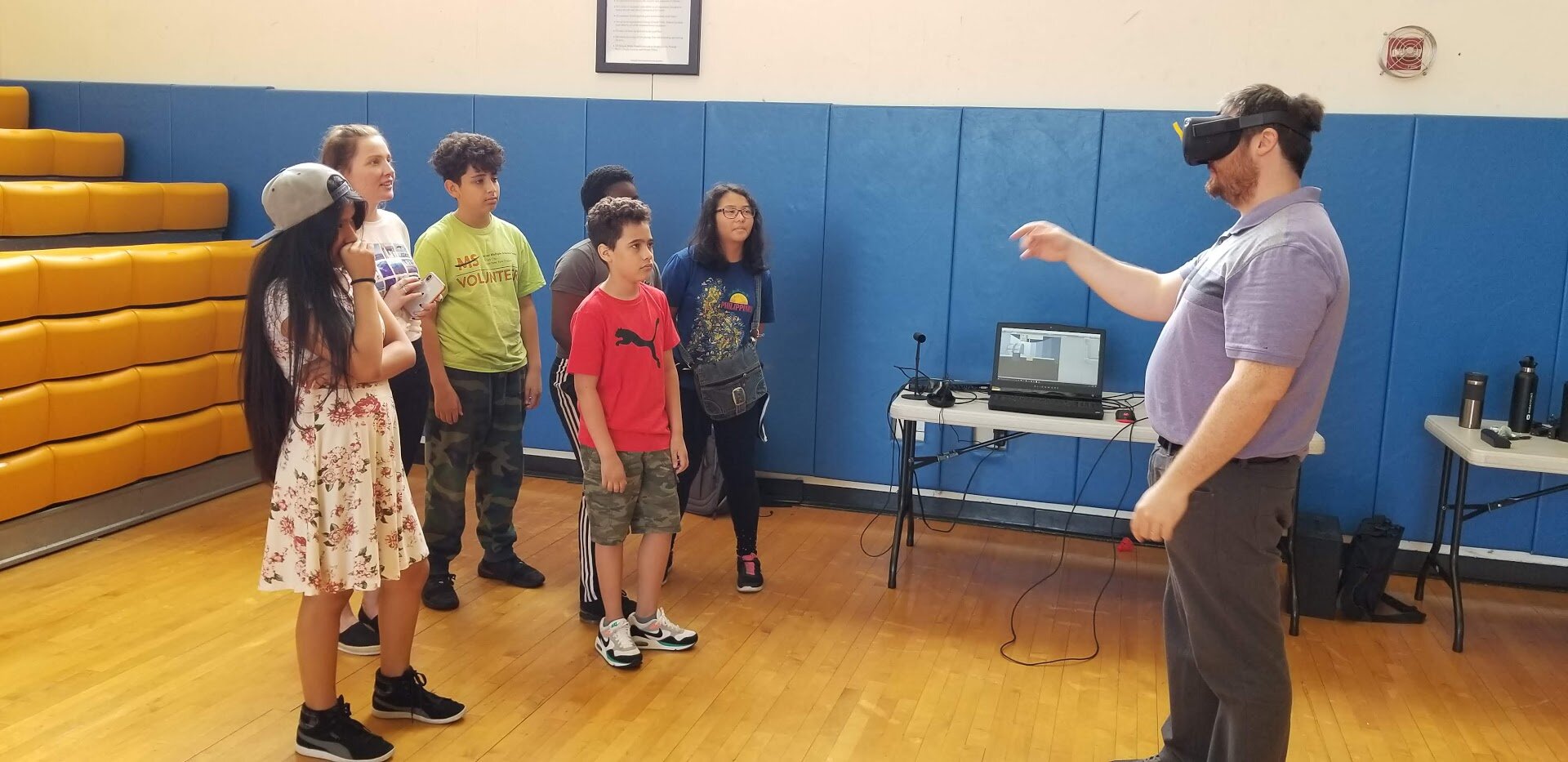
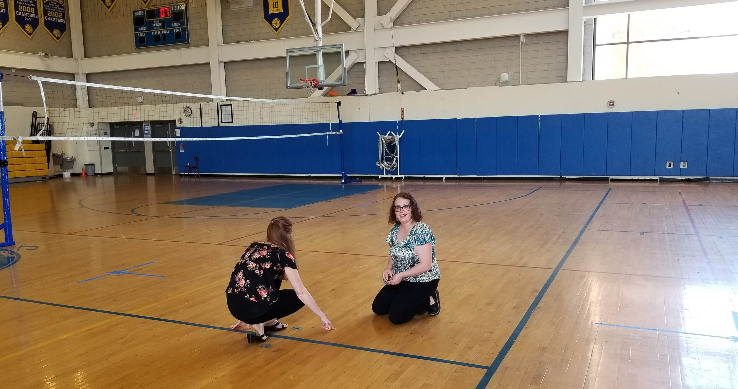
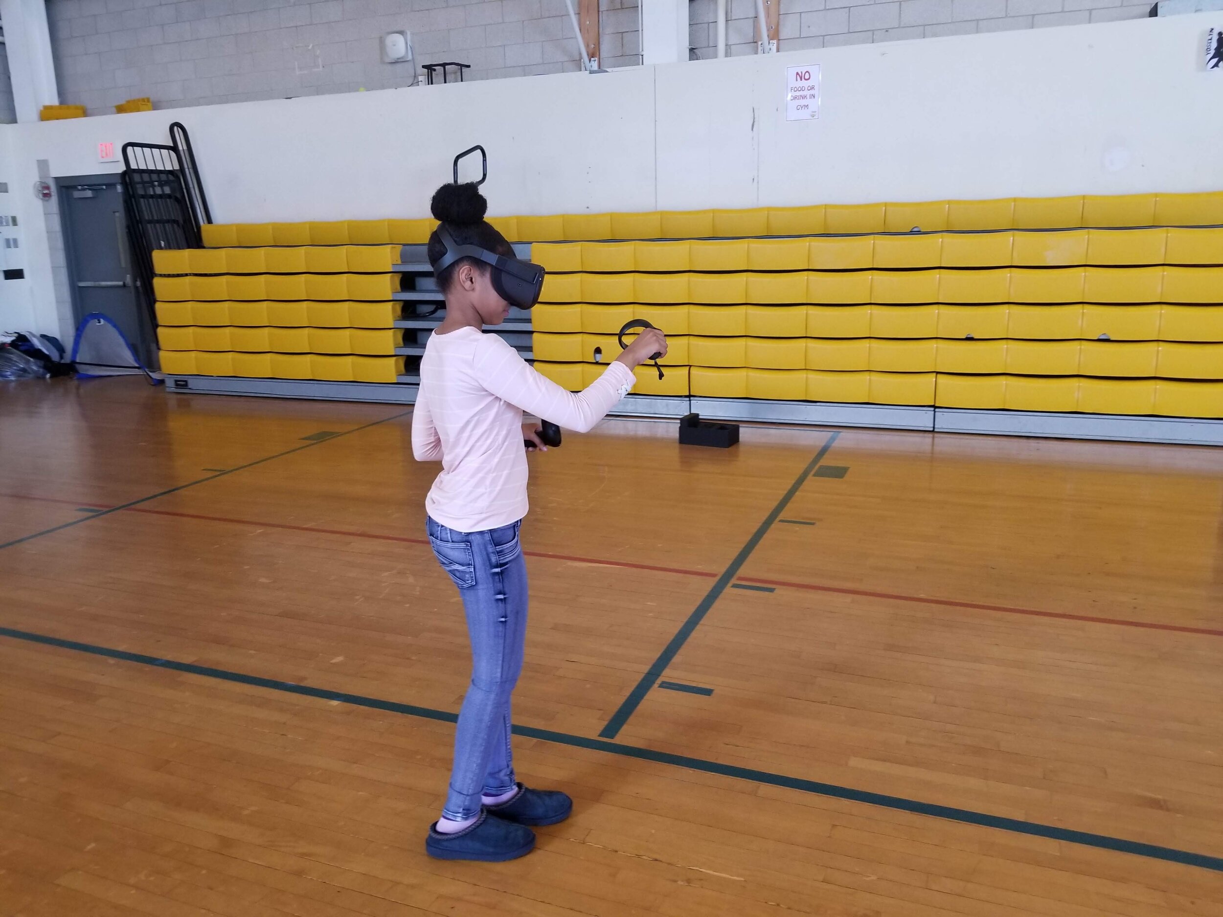
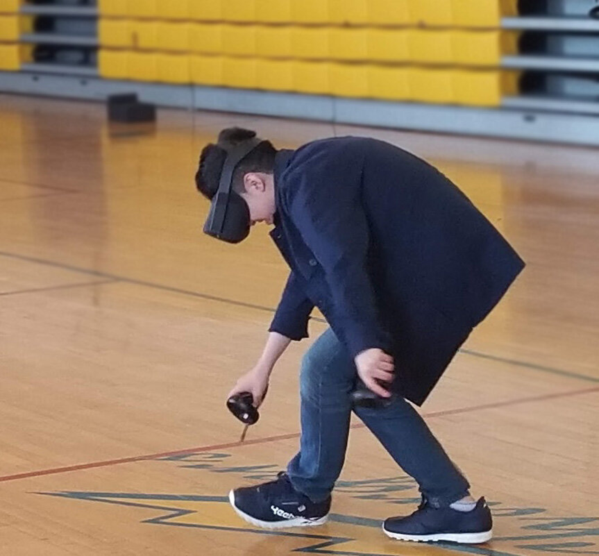
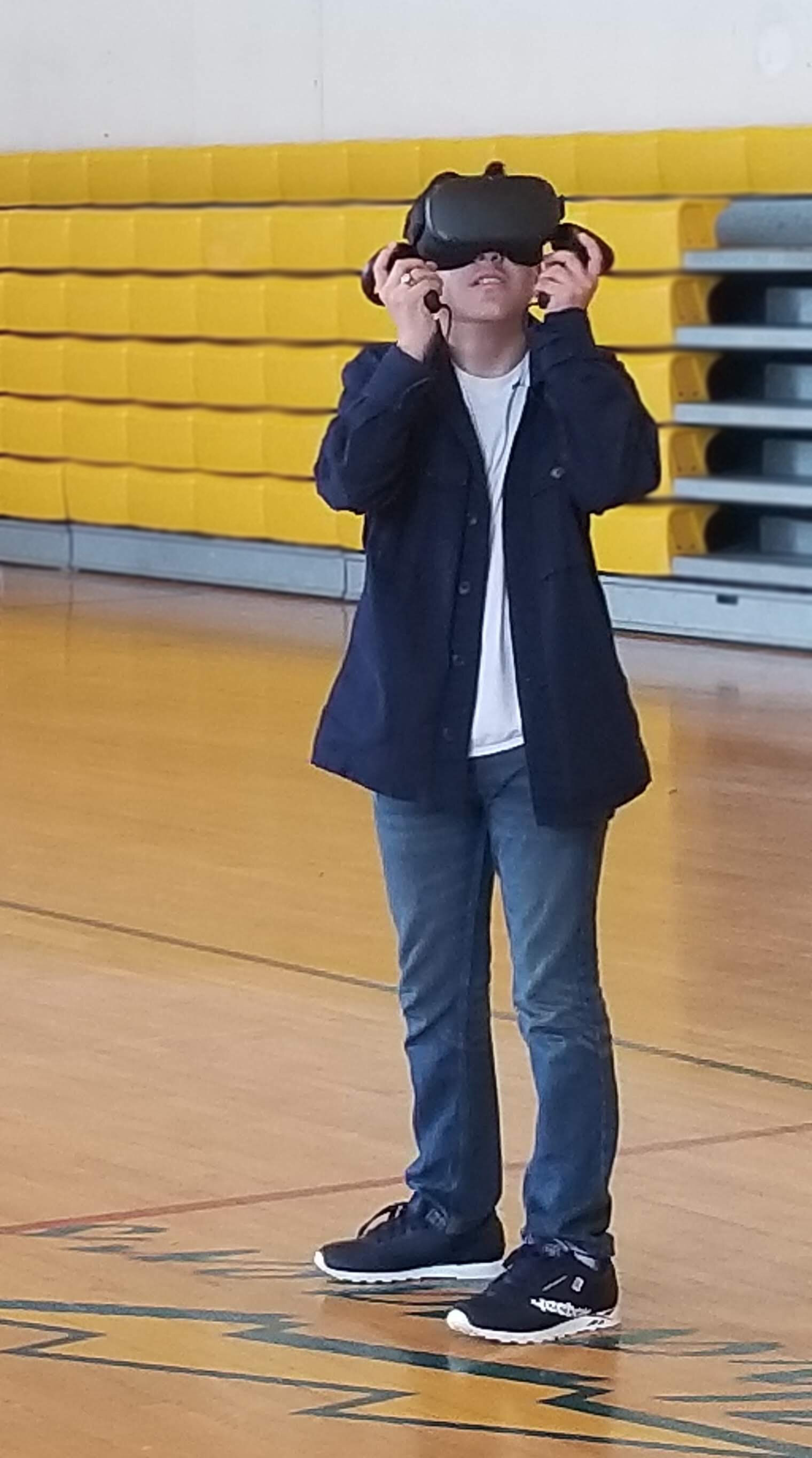
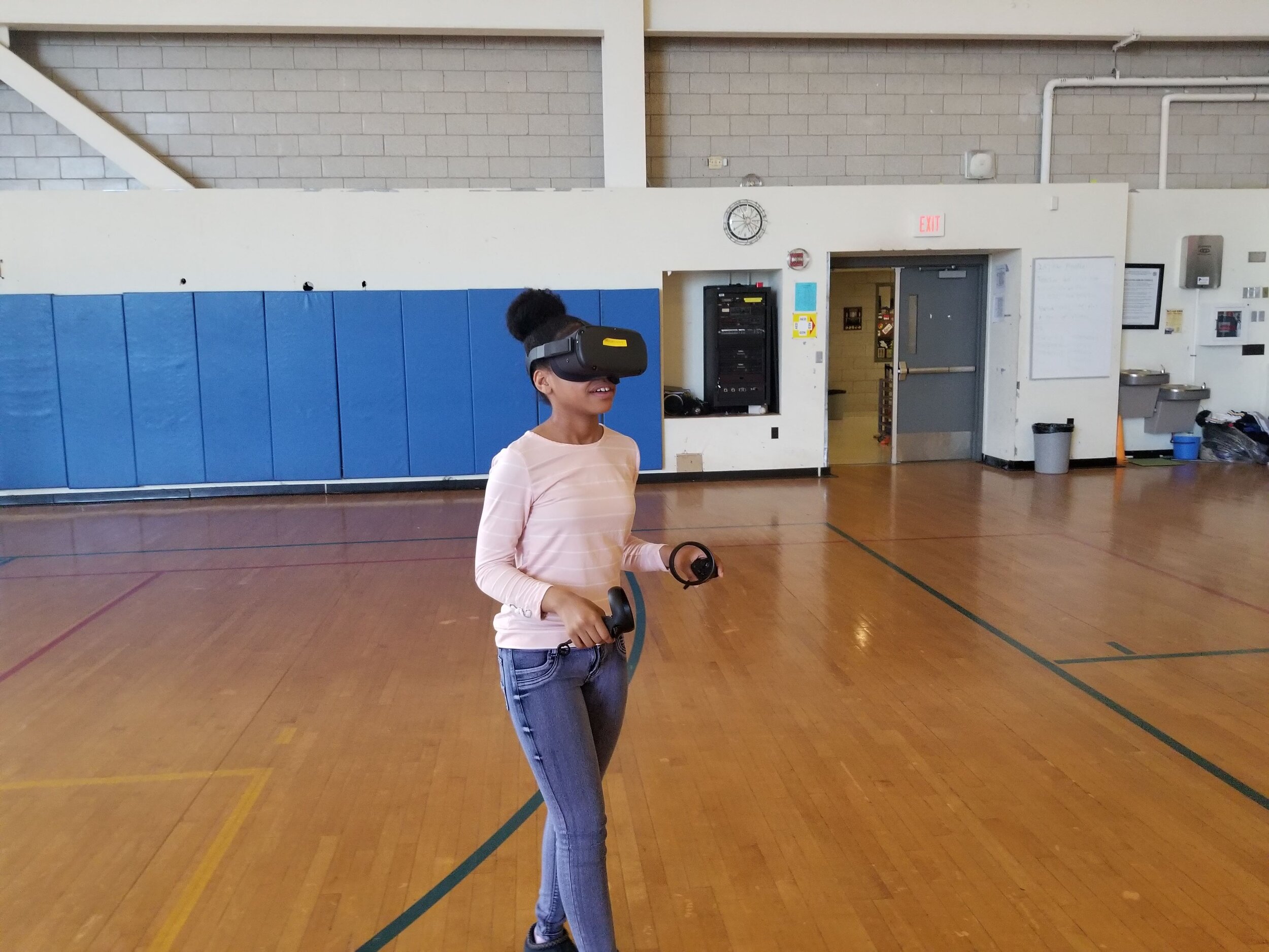
Today, at Science Park High School in Newark, the team was able to watch several groups of middle schoolers play in the Oculus Quest app. The team who attended this user study consisted of two researchers, a developer, and a designer. Middle school teachers also came to watch the study as their students walked around the gymnasium in the new Oculus Quest headset. Students were first, given a pretest on the subject matter before going into the experience, followed by a post test and interview after participation in the experience. Each group consisted of 5 students who were placed within a 20 x 20 ft outlined boundary space, marked with blue masking tape. Students were then instructed to begin the experience, which would be timed for approximately 15 minutes.

NJIT team members pose in a group shot with the wonderful user test participants from Science Park High School
The outcome of this user study was highly rewarding with a few students opting to play a second time. The overall impression received from observing the students was that the experience,even in it’s rough state, was engaging and fun. Students made full use of the Quest’s un-tethered feature, breaking out into victory dances and freely moving about in their 20 by 20 foot space. Other than observations and brief verbal feedback between the supervising designers, students took a post test and were interviewed about the experience. The team hopes to learn much more about the feedback from these interviews and plans on moving forward with development based on this feedback.
Locks and Levers - 6/6/19
After a brief feedback session with team researchers, more alterations had to be made. The levers had previously been designed to indicate a locked and unlocked state, by using the colors red and green (red for locked, green for unlocked). This concept was not understood by the team researchers as the concept of something being locked in most digital platforms is typically indicated with a grayed out button or a lock icon. The red and green colors on the lever knobs were confusing due to these facts and after much iteration, the team concluded to use dark gray for locked, as well as providing a lock icon at the base of the lever, for reinforcement.


Station Redesign - 5/25/19
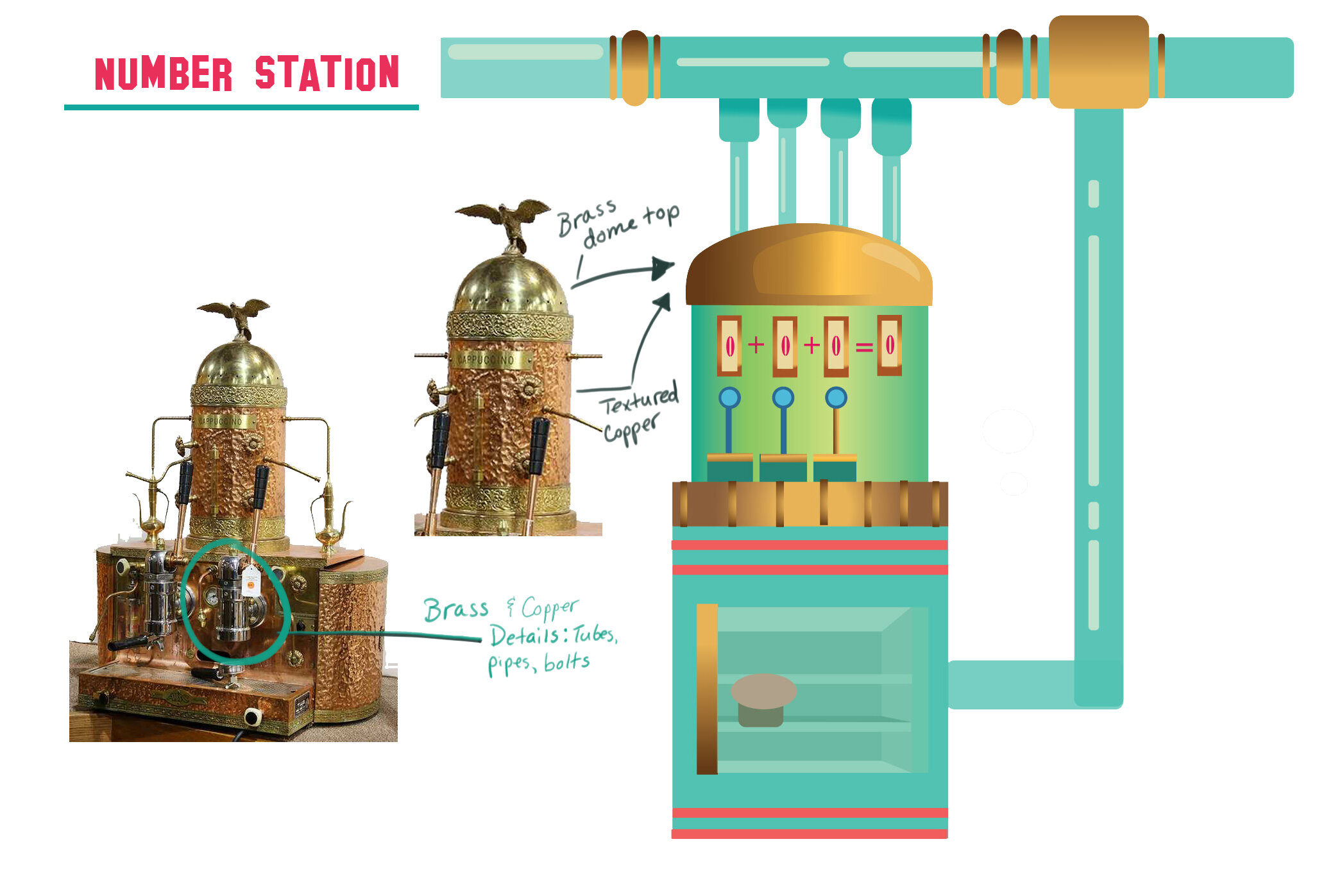
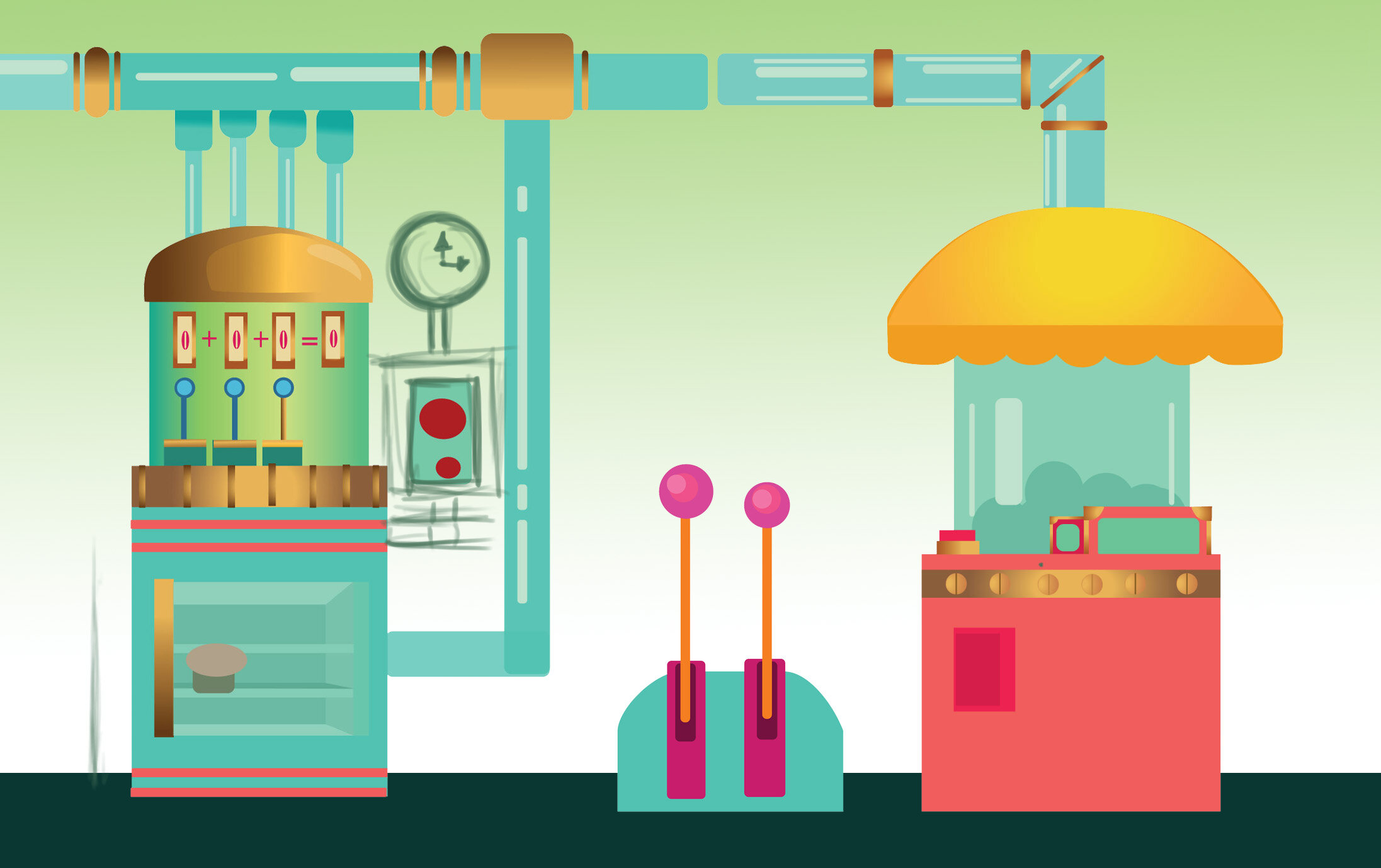
Alterations were made to the number, color, and shape stations. After evaluating the functions of these stations, it seemed that only the number station related to binary math principles, so the color and shape station were changed to have activities related to binary math learning. The color station was originally designed to have 3 dials, each underneath a corresponding color of RGB. The objective was for the user to find the number value of a certain color, such as aqua marine, however the objective has been redesigned so the user must solve a binary math equation to get their desired color. Eight color swatches are provided, each labeled with their binary representation. This information is on the station itself, in the form of a manual which the user can refer to when completing the activities.
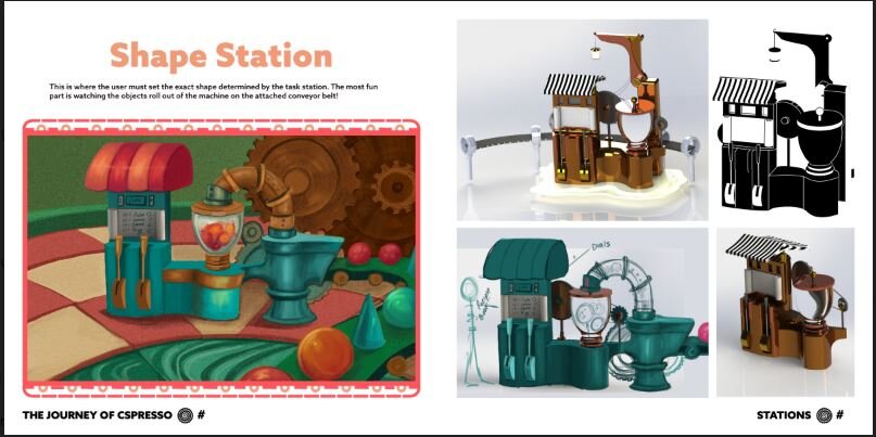
The shape station’s design and objectives was never fully developed, but the team created a more relevant function for it, as it now relates to binary math. This interaction has been updated so that the user has to follow a “recipe book,” or legend in order to create the exact shape determined by the Task Station at the beginning of the experience. The designers settled on a scroll which is attached to the face of the station where the user can easily view what number combinations are needed to produce a particular shape.

Visual Development - 5/24/19
Visual development for the application began in the hopes of getting the prototype somewhat polished for the June 8th deadline. The look and feel of the experience was decided upon after researching various programming games and VR experiences designed for a wide age group. A few consistencies found within these different games were the bright, playful color palettes, simplistic, almost low poly designs, and cheery atmosphere. After researching the demographics of users for these various titles, it was concluded that these visual elements appealed to both male and female users, as well as diverse age groups. It was important to find an aesthetic that can appeal to a large group of users since one of the objectives of the experience is to attract users of diverse academic backgrounds and skill levels. The application should encourage those who have not considered programming or computer science, to participate so that they may expose themselves to knowledge which they may not under typical academic circumstances.

From Sketches to 3D Models - 5/21/19
After our iteration session on the environment, design and UI development, Eric was able to get a rough model in unity using primitives, based on my sketches. We have made the space smaller, so the user will be in one large room, whereas before, each station was designed to be in its own space.
To begin the design process on the current primitive models, I will be bringing the models into Quill and Medium where I can do rough modeling over the base shapes.
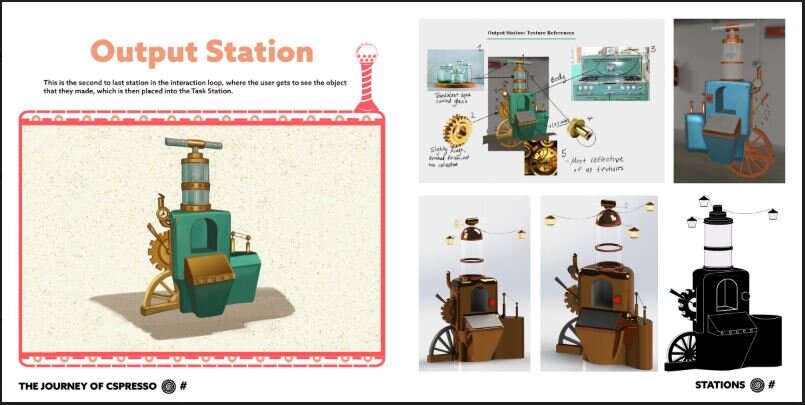
More of the stations were modeled. Changed had to be made to the stations with buttons because they were not registering with the hand controllers on the Quest. Due to this, a considerable amount of time went into redesigning the output station and mission station, as the buttons had to be changed into levers. All interaction objects are levers, most with dials that move as the levers are being moved.

Output Station base model
Navigation - 5/20/19
The team is currently discussing the options for navigation within the experience. Due to time constraints, the option of having a character guide to bring the user from station to station, is not feasible. This leaves only a few other options which include voice over prompts, text panels or signs, and adding constraints to what the user may or may not be able to do, to prevent him or her from getting distracted and wandering off course. Other possibilities included visual cues such as blinking lights, which may appear at the feet of the user when the experience begins and then projects outward in a dotted path to direct the user where to walk.
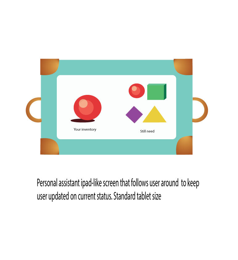
Another possibility is to include a station dedicated to help and guidance.This station, (the Help Station), will have elevation controls (up or down), to take the user from one level of the station to another. These features would include an interactive map of the entire play area and other information to help guide the user through the experience such as clues, guides on how to use the different stations, and a guide to binary numbers just in case the user does not understand the number station activity. After working out the current timeline until the June 8th deadline, this idea was archived along with the character guide.
For the time being, the team has decided to stick to either voice overs or text boxes, which are much quicker to implement. These more elaborate options will be revisited after the June 8th deadline.

Storyboard by Jessica Ross Nersesian
Ergonomics and Scaffolding - 5/9/19
The grabbing motion of the levers need work because the hand goes through the lever and does not properly wrap around when grabbing it. This might be fixed by finding a way to knock it into place with something or telling the user to hit it up or down.
Today was dedicated to developing the educational scaffolding and understanding the ergonomics.
Focusing on these topics revealed a few issues with the team. First, there was a concern that the middle schoolers (our test subjects on June 8th), may not be VR trained and so this would add more work on our part to be sure that the tutorial has some basic VR training. This requires more instruction and prompting within the introduction of the experience and may lead to more confusion for the user if not properly implemented.
Initial Prototyping and First Round of Alterations - 5/8/19
Changes were made to the initial 3D prototype of the stations after the team evaluated current progress on these designs. One of these alterations was the name plate, positioned on top of the station. This nameplate added extra clutter to the kiosk’s interface and if the station is designed well, there would not be a need for a label of what that station is. If after the station is designed and the team feels that reinforcement information is needed for the user, then the written name plate could be supplemented with icons, which offer a quicker way to deliver information and don’t add much clutter.
Each station’s UI was carefully observed in 3D space, then altered accordingly. The number station proved to be the most time consuming, as there are multiple functions and interactables needed to complete the task.
The design team went back to wireframing to brainstorm the best way to organize this information. This was a long, yet rewarding process, resulting in a much improved wireframe of the number station. The design team first drew out the UI of the number station and realized the display screen may be too confusing for the user to read because it contains both the total and the equation.

Space and Ergonomics - 5/7/19
The next topic focused on was the matter of space and ergonomics. In the prototype, the stations are built like small kiosks or game consoles, about 6 ft tall. There are currently 6 stations all together and are arranged within a circle, to indicate the flow of interaction for the user.
After seeing the interior design of the station in 3D space, the design team felt that the space was too small and cluttered. To solve this issue, the design team altered the original floor plan of this space so that there was more room between stations for the user to walk through. The 3D model was updated to fit the new design, being careful to leave enough room for the transparent domes which are meant to be over each kiosk, making 5 independent small stations placed around the one main Mission Station.
Due to the time constraints, this idea was cut so that all 6 stations are within one dome, making it one whole station. The original layout design for this environment is being archived for the next phase of development.
The next challenge would be to design the interior environment to accommodate our target audience The issue with this target audience is the wide array of heights to consider, due to the varying growth spurts of puberty. Focusing on middle school children is a challenge for this reason, as it encapsulates the beginning of those pubescent years, which are typically 10-15 years old in boys and even earlier in girls, from 8-13 years old. This made the concept of predicting a common height to build around, very daunting because height is particularly hard to predict depending on when the individual’s growth spurt begins.
Currently, the team is spending time on some light research into what average height to build around depending on all of these factors. The objective is to build a space that is “ergonomically sound,” for as many users as possible. This means that the dashboard with the controls need to be placed at a level where the user does not need to bend down or tilt their head up. The width of the dashboard, UI, and display all need to be designed within the scope of the user’s vision and height. For example, If the kiosk is too small or too large it will not be comfortable for the user to interact with.

Began Educational Scaffolding - 5/6/19
The team gathered to collectively agree on priority objectives. First, the main goal was to develop an effective CS education application in VR, using the Oculus Quest. The supporting objectives of this goal focused on ways to collect evidence that this VR application was successful. The parameters for measuring the success of the application would include whether or not the user learned CS principles from the experience and if the user enjoyed the experience.
After establishing these goals, the team was ready to determine the target audience and demographic for this application. STEM is being introduced more regularly in k-12 education, so that students are encouraged to pursue career opportunities in technology related fields. Middle school students seemed to be the best group to focus on for this project for a few reasons, the main reason being the age limit for use of Oculus gear, which is currently set to 13. Most VR applications are designed for users around this age.
Planning the Research - 5/3/19
Today’s agenda included how to plan user studies for the CS application. The team discussed many different methods of user testing to consider such as usability studies and use case/heuristic studies. Both methods were feasible for the June deadline, so this would be the starting point for planning the research.
Ideally, the team researchers would have 2 weeks of analyzing the data from around 50-60. How to collect and evaluate this data was the next stage of planning. Methods agreed upon within the team included the following:
Surveys
Cognitive walkthroughs
Observation through ethnographics
Direct observation using direct video from the experience

Interaction Design - 5/5/19
Goals for today included establishing both game and learning objectives. Whether or not the user reached those objectives during the experience would depend on how well the interactions were designed. Each interaction within the experience must have a direct purpose in facilitating desired outcomes. Due to this, the team spent time examining all current interactions and understanding what each interaction would entail, it’s purpose, and how easy those interactions were for the user to learn.

The next step was to break out the interactions into 3 categories:
Macro Interaction Designs- From the perspective of the system
Middle Interaction Designs- From the perspective of the stations
Micro Interaction Designs- From the perspective of the individual elements (buttons, levers, ect)
After breaking these interactions into categories, the team was able to design more through user flow diagrams and identify potential problem areas where the user may get confused or frustrated. Identifying these pain areas was crucial in the continuation of the experience design. After this session, the designers are more confident in the iterations made to the previous UX design.
Deliverable Roles, Priorities, and Schedules - 5/2/19
Development on the UX design of the experience is taking more time than originally estimated, so the team had a meeting to discuss how to make the June deadline. The first plan of action was to limit the number of features and interactions of each station. Once more constraint was added to the design objectives, meeting the deadline was more feasible. The UX designers were able to begin on planning the micro interactions for each station:
Micro Interactions-Categorized by these properties:
Triggers
Cues
Behaviors
Actions
Modes
Mode selectors
Feedback
System
Once these micro interactions were sorted out, the designers decided to make the stations “single mode.” For example, Instagram has the ability to browse, post, comment, tile images but in this experience we have not defined micro interactions in VR it has been a challenge because there is nothing to reference. To keep these processes and design within reasonable scope, the elements in the experience mono mode
Documenting Blog for Team Communication - 4/30/19
Eric shared documents of past development projects so that we could use the same templates for our documentation for the Quest project. From this point forward, there will be a daily blog/journal posting of what was done on each day of production.
Adam tested Eric’s prototype in the Oculus Rift
We planned how to document all of the research and notes; we’ll have 2 documents- a developer journal and a prospectus
Flowchart of Run Through of Experience - 4/25
Team realized there would need to be a total of 12 steps in the beginning tutorial, just to get the user to the task station.
UX designers worked on standardizing all the actions; grabbing, pushing, placing
No possible failure points every action is prompted
Goal is to standardize all vocabulary when relaying info about the flow charts, mechanics, to prevent confusion
For these initial run throughs, we are only focusing on 3 stations; the OPS (output station), MS (mission station), #S (number station)
Established that there would need something in charge of prompting, guiding users as well as something to tell the user when they made a mistake. For right now this is called “The System,” until we can agree on what that will be (a character/host, or voice overs coming from each station)
Navigation possibilities were discussed to help guide the user, in addition to the other cues. Some possibilities were dotted lines that light up from the user’s position to the desired location, (much like how this is done in the Quest demo).
Wireframes were drafted of the 3 stations being focused on; OPS, MS, #S
The team designers thought of possible scenarios that would get in the way of the user successfully completing the game. To do this, they planned one such scenario and designed the solution to get the user back on track:

Binary Math Lessons - 4/23/19
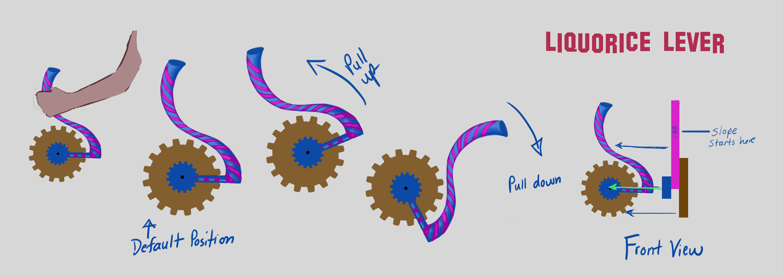
After the team researchers decided to choose binary math for the learning objective, the designers began whiteboarding possible interactions. First, they would have to figure out how to represent binary numbers in a 3D space. This concept would be represented in the experience as levers the user would pull up or down, to change a number from 1 to a 0 or vice versa.
The levers would have 2 positions so as to not distract the user from the 0 or 1 action. There would also need to be a display at this station which directly reflects the actions of the user.
The experience was wireframed in a concentric circle pattern, where the user would start and finish at the same location. There would need to be an introduction to acclimate the user to their virtual environment and teach them what to do. The designers wireframed a user flow similar to an assembly line, where the user would move from one station to another station, to complete a task. These stations became central to the interaction design of the experience:
Output Station (OPS)- User would need to train for the OPS first
Color Station- RGB the user would be given a color to match with 3 dials. For example the color, aquamarine’s binary representation is (RGB value 66,244,238).
Task station- Where user goes to get a task.
Opening Discussion - 4/1/19
The team began the discussion of possible approaches for the coding experience in VR. Questions were explored, such as, “What theme would be used, what lessons in CS to teach and at what level of difficulty?”
Various CS learning activities and gaming applications were researched and discussed. This gave the team a starting point to begin brainstorming. Some of the gaming applications included in the brainstorming session were Tynker, Alice, Scratch, and Kano. Most of these digital CS applications used something referred to block code by CS educators, where the user would for one line of code by dragging and placing colored blocks into a sequence to produce the desired outcome. The Harry Potter application from Kano was a perfect example of how to gamify the subject of CS for younger audiences, which uses this block code method. Users have a hand held wand which they physically move in formulated motion sequences, each with a different outcome.
The block code seemed to be the most favored and sensible method of CS learning to implement after trying out these other applications, but after more discussion the team realized that translating this technique into a virtual 3D space would not be effective. One of the main objectives for designing this application is to encourage the user to move freely and be active during the experience. More game mechanics and interactives would be drawn from this objective, so that the user could learn CS through spatial learning, within their immersive world.
First Team Meeting - 4/3/19
Today marked the first official day of development on the education app for Oculus Quest. The objective of this project is to develop an educational game application about Computer Science, using the new Quest from Oculus. This project will include a small group of UX/UI and visual designers, CS instructors, HCI researchers, and student volunteers.
Using this new hardware presents many exciting opportunities, due to the completely untethered nature. There are absolutely no wires or cables attached to the head set or controllers and there is even a camera placed within the headset, so there is no need to set up outside sensors. This offers the user the freedom to roam and move more freely around their physical and virtual space, lending yet another level of immersion for the user.
The timeline for this application is not entirely certain, aside from a potential user study on June 8th, with middle school children at a local STEM highschool, here in Newark. The team has began putting together basic parameters for what this application must include and how much of the overall experience should be completed by that time. Realistically, the end product for this deadline will be in a demo state, where the experience only includes the basic game mechanics and features. Setting these parameters of this expected level of completion makes this goal attainable and allows the team to better prioritize this short time period. Some of these first priorities include what CS concept to teach, how to teach it spatially, how to make full use of the Quest’s untethered functionality, and how to make the experience enjoyable, so that users are playing while learning.
The team began to kickoff the project with a brainstorming session, where members can begin exchanging their own ideas about possible genres, subjects, and interactions. Collaboration began to take shape once the researchers gave a few options of CS lessons to include in the experience. Some of the CS lessons included activities called, boolean algebra, building logic states, if statements, and logic puzzles.
The basic interactions and gameplay would need to be designed around these activities. One particular source of inspiration for CS activity lessons is an organization called CS Unplugged, a free collection of lessons and fun learning activities that teach both children and adults about CS. The materials are available from the website, which was put together by Computer Science Research Education Group, at the University of Canterbury in New Zealand. This source was an invaluable starting point for the team to begin building their experience, as the very nature of these activities is utilizing physical space and hands on learning without a computer.
VR Design Doc | AR Design Doc (PDF) | Visual Development | Dev Blog | Art Book | AR App Book