Social AR/VR - Social VR UX Research
Theater AR Use Case | Social VR UX Research
Overview
Modern team-centric work environments require a level of collaboration skills proven difficult to teach in undergraduate education as it is often lacking, not effectively implemented, and conflicts with student schedules. Our research team sought to solve these issues by designing a set of collaboration curriculum and testing it on an experimental groups that met in person and in VR, with the objective of finding effective curriculum for both on campus and distance learning situations. Upon completion of the study, one activity was selected to research better VR collaboration solutions. We found that smart objects could solve a majority of the issues.

Initial storyboard after brainstorming how a smart object might behave in VR.
Background
VR applications, like Facebook Spaces, offers users the ability to socialize in virtual spaces to form relationships with fellow students in fun, unique ways. While we did observe successful socialization in our experiment, opportunities for improvement were noted. We decided to choose one of the activities to create a case study for improving our VR collaboration activities.
Lost at Sea is an activity for small groups of people to practice group decision-making skills. The group is presented with the scenario of being lost at sea with a list of supplies. The group must choose the order of importance of each item. The activity was modified to provide a reasonable facsimile within the Fall 2018 version of Facebook Spaces, as seen below.

Fig. 1 Physical Implementation of Lost at Sea
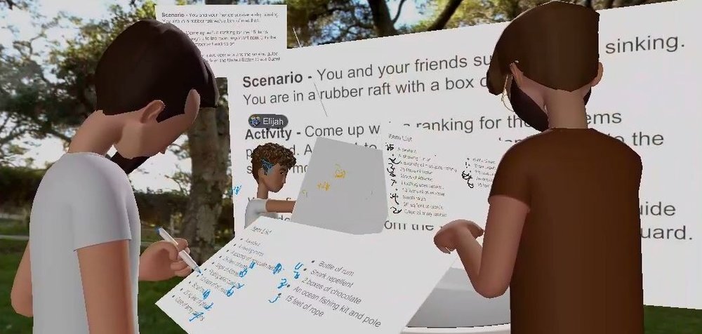
Fig. 2 Virtual Reality Implementation of Lost at Sea
UX Research Case Study: VR Collaboration Activity “Lost at Sea”
Video Ethnography
We gathered information from our study’s VR users by watching videos of them participating in the Lost at Sea activity recorded from within Facebook Spaces. We observed and took notes on the problem space and users without a defined objective as it would influence our findings and inhibit our ability to observe beyond it. Observations were listed on sticky notes for organization.
Affinity Diagrams
Once video footage was reviewed, we organized our observations into categories of platform, content, and collaboration. Comments and behaviors were sorted into these categories and we were able to view this virtual collaboration through a more empathetic lense. Our mantra became “encourage collaboration through own content within the constraints of the platform.”
Using an affinity diagram we organized our observations into 3 broad categories:
Platform usability and familiarity issues
Content issues with instructional understanding and item recognition
Collaboration issues revolving around items and problem-solving processes

Fig. 5 Affinity Diagram organization of our ethnographic notes
Experience Maps
Mapping participants’ thoughts, actions, and feelings throughout the length of the activity gives us a good understanding of our users’ perspectives. It is meant to provide some additional structure to the insights we got from our affinity diagram. At this stage, our goal was to create a document which would allow us to point to specific places on the activity’s timeline as we talk about pain points, observations and future ideas. Major sections of the timeline include reading instructions, individual user ranking of items, group ranking, and final scoring.

Fig. 6 Experience Map of user personas and behaviors
User Personas
The next step in the process of organizing the observational findings is extrapolating user personas from the behaviors, personality types, and dialogue recorded. User personas are crucial for Human Centered Design; a practice which requires user feedback and observation to design the best possible user experience. By examining how these students behaved as users in VR and participants in the group activity, we began forming the user personas.
Personas were created to represent a common personality type, accompanied by a related comment or behavior. From group observations, we were able to identify the following personas:
Chad: Tendency to show off, performer, brash, talkative, center of attention
Jenn: Focused, reserved, wants to do well, on-task, pressure to perform
Brian: Tendency to come off as arrogant, likes to be right, needs to be validated, follower
Raj: Keeps to himself, fidgety, restless, explorer, tries to keep busy, off-task
Steve: Cares about teammates, likes collaborating, peacekeeper, negotiator
Personalities were developed along with assigned names and attributes. Comments collected by observation as relevant user data were assigned to the most reflected persona. The same process was done with behaviors which were associated with each particular personality type.
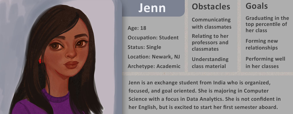
Fig. 8 Persona profile of Jenn
Problem Scenario: “What’s a sextant?”
From the video ethnographic findings, our team noticed a common situation that occurred after participants read the list of objects. The navigation object known as a sextant stumped most participants. The extroverted participants would ask out loud what this object was, while the introverted participants would disengage from the activity. In either case, these participants could not make an informed decision and their collaboration quality suffered.
Persona: Jenn, introverted academic
Artifacts: List of objects user is expected to rank
Task: Rank a list of objects by their usefulness in an emergency situation
Description: Observed scenarios of users ranking objects they do not understand
User reads a list of objects they are asked to rank
User doesn’t recognize an object (in this case a sextant)
User is too shy/afraid to ask other group members about the object
Exact motivation for this behavior is unknown
User guesses the proper ranking for an object they do not recognize
Problem Statement
We aimed our research to give us a better understanding of two separate, but intertwined domains: our users, and the problems they faced. The intersection of those areas gave us detailed insights into how our users experienced virtual collaborative spaces. As our initial research phase was coming to its conclusion, we have gained a better understanding of our users in the context of the environment and the challenges they faced.
A pattern that stood out the most to us was the repeated misunderstanding of the content by our participants. Our experience suggests that the single, most impactful improvement we can make, is bridging this gap between the content and our users. Doing so will empower the future participant to more confidently participate in collaborative activities with their peers.
UX Design Case Study: Object Contextualization for VR Users
Problem Statement
The designing of smart objects in VR, became the second phase of this project (as we realized after examining data from participants in the Lost At Sea VR experience), a central problem for users was the ambiguity of the objects. This lack of context resulted in users not knowing how to make confident, educated decisions. This was problematic because users were instructed to rank a given set of objects according to its survival relevance, to successfully complete the activity.
We realized that changing something as small as providing users contextual information for these objects, can make a vast improvement within the activity of Lost At Sea and other VR experiences where this information is necessary. From here, we organized the design analysis into 3 categories:
Objective: To improve content recognition by improving context.
Solution: To design interactive objects to improve affordances, help users to understand the objects and cannot make educated confident decisions.
Goal: To design a system for exposing functionality of a virtual object.
Activity Scenario: “Solution is for object to give content about itself”
Persona: Jenn, introverted academic
Artifacts: A set of minimalist 3D models representing objects user is expected to rank
Task: Rank a set of objects by their usefulness in an emergency situation
Description: Potential solution to a user not recognizing an object they are supposed to rank
User analyses a group of objects they are asked to rank
User doesn’t recognize an object (in this case a sextant)
User is too shy/afraid to ask other group members about the object
Exact motivation for this behavior is unknown
User interacts with an object
Object presents information that describes it
User understands an object and moves on with the activity
Once we had defined an activity scenario which the users would find themselves in, our team began to brainstorm various possibilities of how an object can deliver contextual information to the user. This was challenging due to constraints of time and functionality which meant that this design must have limited animations and limited interactions. The other constraint established by the team early in the process was that the context menu must allow the user to also hold the object in question while accessing the menu. This proved to be challenging because it was difficult not to design a system where both hand controllers can be used in activating and interacting with the menu system, to take full advantage of movement and gestures, which is one of the more appealing features of the Oculus Rift and Quest.
Ideation Phase
After 10 separate ideas, our next step was to focus down to 3-4 designs, then iterate and compare those. We sifted through these designs drawn up in the brainstorming sessions by creating flows of how each design would work, evaluate those failure points, check that it meets the design constraints and needs of the user, and how complex or simple the interactivity was.
Smart Object Designs/Analysis:
SpyGlass- User needs both hands
Wand- under-developed
Scroll- Scroll may not attach correctly to all objects (may not be large enough to include substantial information or context
Box with pull out tabs- Cumbersome, user needs both hands
Draw Square-underdeveloped
Raised Platform- Environment based design, does not work with hand held objects
Question Mark Reticle-Requires too many steps to activate
Pull Apart Scroll- Requires both hands
AI Assistant-Out of scope
Paper Plane- Out of scope and is not suitable for a quick interaction.
Aim and Click-Flat UI, breaks immersion, does not offer anything unique to help user remember contextual information

Arm Cuff UI-User access home screen and all relevant info about the object in question

Different types of Menu Systems
Once this iteration session was completed, we organized the design ideas into categories. These categories included: diegetic, non-diegetic, spatial, and meta. We realized that all of the designs, except 1, were diegetic UI designs, which meant that the design was meant to feel like part of the experience. The reason for the emphasis on this type of design was due to the interactive and immersive nature of VR, and aiming for a design related to this medium. Flat UI or non-diegetic UI did not seem to be the best option for developing a unique menu system within VR, as it misses the purpose of VR, which is to feel immersed in an alternate environment.
Problem Solving
The issues with this initial design stemmed from the constraints stated at the beginning of the design process which included the following:

User must be able to access menu with one hand, while the other hand is holding object
User must be able to easily access menu with minimal interactions
Menu is independent of environmental elements and comes from object
Menu must be designed only for the purpose of giving information
Menu must be designed without complex animations
Menu cannot be designed as an AI assistant character
Menu must be readable and suit the VR space
This set of constraints and design qualities provided a framework for the team to continue iterating on. First, we began evaluating different types of UI designs being used in games and other interactive applications. We discussed the advantages and disadvantages of spatial, HUD, diegetic and non-diegetic interfaces and how this applies to VR. All of the design concepts turned out to be diegetic UI, which means that the UI is part of the VR world. This presented a problem because we did not have a particular world to create this design around. Without a predefined world, designing any UI is challenging as there is not clear theme, visual style, or ability to connect the UI to the environment.
Final Iterations
Both these iterations; the information box and the arm cuff, were explored further and iterated on. Currently, the design chosen to develop is a version of the original information box design, where the user received information from 3 cards held within a box, each containing information on a different category of the object, accessed by pulling the tabs upward and reading the card, then yanking the tab upward so that it snaps back in place while the user reaches for another tab/card to read. These categories of information of the object in question include: origin, use, how to use it.
Narrowing Down Options
The team spent the day weighing the pros and cons of each of the final 4 designs. These final design ideas included the arm cuff, box, collapsible spyglass and the scroll. This process involved taking the best features of each of these designs, and omitting the unsuitable features. We listed out these desired features for this context menu while also writing down the constraints. This helped us to keep focus and not stray from the path laid out for us at the beginning of the process.
Desired features were those which allowed the user to make use of movement and gesture, while being able to hold the object in question, in his or her hand, an engaging way to activate and interact with the menu, and a menu which contained the amount of information necessary to fully understand the object.
We thought of how a user may tackle this problem in the real world, if encountered with something which they did not understand, like how to change a tire, or what a certain device is. The user would open up a browser window on his or her phone, desktop, or tablet and search for information about this object or how to use it. We began thinking of how we can solve this problem within VR, as the user currently does not have this ability at hand, which led us to the card catalog drawer.

Final Design Choice
With this final rendition of the “box” idea, we’re confident that it meets the necessities of immersion, easy one-hand interactions, and in-depth contextual information. The user may activate this menu at any time she or he needs to know and understand an object. The card catalog offers 3 categories of contextual information which include origin, purpose, and how to use. Each of these categories offer a level of context to help connect the meaning with the user for an in depth understanding. The card catalog can be activated by simply squeezing down the off-hand trigger (of the Rift or Quest), while looking at the object in question. A blue holographic handle appears in the user’s clenched VR hand and is then cued with glowing arrows to make a pulling motion towards them (as if pulling open a drawer). Once the user has pulled back a small distance, a hologram of the card catalog box transitions into a solid object with 3 tabbed cards, each labeled with the corresponding information: origin, purpose, how to use. The user may leave the box stable in mid air at whatever height is most comfortable for her/him and when the user is ready to close the menu, they are simply cued to squeeze both hand triggers and make a pushing motion. The card catalog condenses with the pushing motion and snaps out of the scene. This may be done as many times as needed.

The card catalog offers 3 categories of contextual information which include origin, purpose, and how to use. Each of these categories offer a level of context to help connect the meaning with the user for an in depth understanding. Once the user has pulled back a small distance, a hologram of the card catalog box transitions into a solid object with 3 tabbed cards, each labeled with the corresponding information: origin, purpose, how to use.

The user may leave the box stable in mid air at whatever height is most comfortable for her/him and when the user is ready to close the menu, they are simply cued to make a pushing motion. The card catalog condenses with the pushing motion and snaps out of the scene.


Theater AR Use Case | Social VR UX Research